 Subscribe
 Follow Us
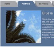
A Tabbed Content Area With CSS3
 13 years ago
 13254
13254 3485
3485
Tabbed content areas, or content switchers, are all over the place. Numerous sites have used them as a way to contain more information in a single location without additional clutter. Tutorials on implementing them are abundant and vary more in substance than execution, typically using a JS library such as jQuery.
In this example we’re doing the same thing, but instead of JS we’ll do it 100% with CSS and HTML.
HTML Structure
The HTML structure is very straightforward, but does require a cosmetic <span> on each <li>.
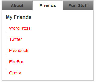
<div id="box">

<ul id="menu">

 <li><a href="#about">About</a></li>


 <li><a href="#friends">Friends</a></li>


 <li><a href="#stuff">Fun Stuff</a></li>

</ul>


<!-- e tab menu -->

<ul id="boxes">

 <li id="about" class="box">

<h1>About me</h1>


Lorem Ipsum is simply dummy text of the printing and typesetting industry. Lorem Ipsum has been the <a href="#">industry's standard</a> dummy text ever since the 1500s

It was popularised in the 1960s with the release of Letraset <strong>sheets containing</strong> Lorem Ipsum passages.


</li>


 <li id="friends" class="box">

<h2>My Friends</h2>


<ul>

 <li><a href="#">WordPress</a></li>


 <li><a href="#">Twitter</a></li>


 <li><a href="#">Facebook</a></li>


 <li><a href="#">FireFox</a></li>


 <li><a href="#">Opera</a></li>

</ul>


</li>


 <li id="stuff" class="box">

<h3>Fun Stuff</h3>


<ul>

 <li><a href="#">Mimeo</a></li>


 <li><a href="#">Dribbble</a></li>


 <li><a href="#">GiantBomb</a></li>


 <li><a href="#">Barnes and Noble</a></li>


 <li><a href="#">Wikipedia</a></li>

</ul>


</li>

</ul>


<!-- e: boxes --></div>


<!-- e: global wrapping #box -->
Div #box wraps both the menu, and the content boxes. Each menu item carries an anchor link to the content box that will be shown when clicked. The menu item ‘About’ for example, is linked to an LI with the ID ‘about’.
/*

Theme Name:
Theme URI:
Description:
Version:
Author:

*/

   /* Global Layout */

body
{
font-size: 12px;
margin: 0px;
text-align: center;
background: #fefefe;
color: #333;
font-family: Arial, Helvetica, sans-serif;
}

#box{
 margin: 150px auto;
 width: 300px;
 text-align: left;
 border: 1px solid #ccc;
 -moz-box-shadow: 0 0 3px #aaa;
 -webkit-box-shadow: 0 0 3px #aaa;
 box-shadow: 0 0 3px #aaa;
}

 #menu{
  overflow: hidden;
  background: -moz-linear-gradient(top, #999, #666);
  background: -webkit-gradient(linear, left top, left bottom, from(#999), to(#666), color-stop(1, #fff));
  background: linear-gradient(top, rgba(40,34,32,1), rgba(22,18,17,1));
 }

  #menu li{
   float: left;
   width: 99px;
   border-right: 1px solid #999;
  }

  #menu li a{
   float: left;
   width: 99px;
   color: #333;
   font-size: 14px;
   font-weight: bold;
   height: 16px;
   padding: 8px 0 8px 0;
   text-align: center;
   z-index: 10;
   position: relative;
  }

  #menu li a:hover{
   background: #fff;
   text-decoration: none;
  }

 #boxes{
  position: relative;
  min-height: 250px;
 }

  #boxes h1, #boxes h2, #boxes h3{
   font-size: 16px;
   font-weight: bold;
  }

  .box:target, .box:first-child{
   display: block;
  }

  .box{
   padding:12px;
   display: none;
   position: absolute;
   top:0;
   left:0;
   width: 276px;
   min-height: 226px;
   background: #fff;
  }

  .box:target span{
   height: 32px;
   width: 99px;
   background: #fff;
   display: block;
   position: absolute;
   top: -32px;
   z-index:0;
  }

  #about span{
   left:0;
  }

  #friends span{
   left:100px;
  }

  #stuff span{
   left:200px;
   width: 100px;
  }

  .box ul, .box p{
   line-height: 1.5em;
   padding-top: 1em;
  }

  #boxes a{
   color: #ff0000;
  }

  .box li a{
   display: block;
   line-height: 2.2em;
   font-size: 14px;
   margin-bottom: 6px;
   padding-left: 10px;
   border-left: 1px solid #bbb;
  }

  #boxes ul li a:hover{
   color: #fff;
   font-weight: bold;
   background: #999;
   text-decoration: none;
   border-left: 1px solid #555;
  }
The CSS is fairly straightforward as well. Ignoring the cosmetic styles, we have a container wrapping all three content boxes, ul#boxes. It uses a set height as does each child list item. The set height insures that each content box is of the height. This is important because the content sections are absolutely positioned.
Each list item carrying the class .box has a unique ID. The class is used for general styling, while the ID allows menu selection of a single box. .box items are set to display: none; by default (inactive). This would leave all content boxes hidden when the page first loads, so we set display: block; on .box:first-child so that the first .box item is displayed by default.
The :target pseudo class is applied to the ID specified in any anchored link (href=”#about” etc), so we want to add a pseudo class to our .box like so:
.box:target{
   display: block;
  }
:target is removed from the current target when a new anchor is passed.
The activate state on the nav is hidden by default, and only shown when it’s parent .box is enabled. This means that there is no activate state on the menu by default. The active state is actually the cosmetic span I mentioned earlier, absolutely positioned to sit below the relevant menu item.
  .box:target span{
   height: 32px;
   width: 99px;
   background: #fff;
   display: block;
   position: absolute;
   top: -32px;
   z-index:0;
  }
This fixes the span to the top of the menu, now we need to position it below the appropriate menu item. We use the .box IDs for that. On #stuff we extend the item an extra 1px to cover the border of the list item it sits above.
  #about span{
   left:0;
  }
  #friends span{
   left:100px;
  }
  #stuff span{
   left:200px;
   width: 100px;
  }
We’ve given the span a z-index of 0 and the list item links a z-index of 10 so that the text of each menu item is above the span.
Using target is really easy, and super useful. Whatever item ID you reference in your anchor link will be given the psuedo class :target until a new anchor link is clicked. You can use this in a variety of ways, a tabbed content box is just a very simple example.
You might also like
Tags
accordion accordion menu animation navigation animation navigation menu carousel checkbox inputs css3 css3 menu css3 navigation date picker dialog drag drop drop down menu drop down navigation menu elastic navigation form form validation gallery glide navigation horizontal navigation menu hover effect image gallery image hover image lightbox image scroller image slideshow multi-level navigation menus rating select dependent select list slide image slider menu stylish form table tabs text effect text scroller tooltips tree menu vertical navigation menu