(Colortip)multiple color jQuery Tooltip Plugin

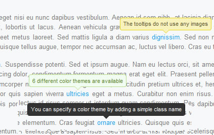
we are going to write a simple jQuery tooltip plugin. It is going to convert the title attributes of elements withing your page, into a series of colorful tooltips. Six color themes are available, so you can easily match it with the rest of your design.
Step 1 – XHTML
The plugin we are about to write today, works by converting the title of an element on the page to a structure of three spans, which form a tooltip, displayed on hover. So if you start with a regular link like this one:
<a href="#" class="blue" title="Go to Tutorialzine">Tutorialzine</a>
jQuery will convert it to the markup you can see below.
<a class="blue colorTipContainer" href="#">Tutorialzine
<span class="colorTip" style="margin-left: -60px;">Go to Tutorialzine
<span class="pointyTipShadow"></span>
<span class="pointyTip"></span>
</span>
</a>
Notice that the first block of code above specifies a “blue” class name. This is because we are overriding the default color of the tip (yellow). You can choose from red, blue, green, yellow, white and black, or you can create your own colors in the plugin stylesheet.
Users which have JavaScript disabled are still going to see the regular title tooltips on the page, so the script degrades gracefully.
Step 2 – CSS
To display the colorful tips on your page, you first need to include the plugin stylesheet file in the head section of the html document.
<link rel="stylesheet" type="text/css" href="colortip-1.0/colortip-1.0-jquery.css"/>
You could also just copy the styles from the file and paste them directly in your main stylesheet, if you do not want to keep a separate include file. This stylesheet defines both the positioning and the design of the tooltips. It comes with six color themes, and you can easily add more.
colortip-1.0-jquery.css – Part 1
.colorTipContainer{
 position:relative;
 text-decoration:none !important;
}

.colorTip{
 /* This class is assigned to the color tip span by jQuery */

 display:none;
 position:absolute;
 left:50%;
 top:-30px;
 padding:6px;

 background-color:white;
 font-family:Arial,Helvetica,sans-serif;
 font-size:11px;
 font-style:normal;
 line-height:1;
 text-decoration:none;
 text-align:center;
 text-shadow:0 0 1px white;
 white-space:nowrap;

 -moz-border-radius:4px;
 -webkit-border-radius:4px;
 border-radius:4px;
}

.pointyTip,.pointyTipShadow{
 /* Setting a thick transparent border on a 0x0 div to create a triangle */
 border:6px solid transparent;
 bottom:-12px;
 height:0;
 left:50%;
 margin-left:-6px;
 position:absolute;
 width:0;
}

.pointyTipShadow{
 /* The shadow tip is 1px larger, so it acts as a border to the tip */
 border-width:7px;
 bottom:-14px;
 margin-left:-7px;
}
The .colorTipContainer class is assigned to the elements to which the color tips are added. It sets their positioning to relative, so that the tips can be centered above them.
A neat CSS trick is used to create the triangular pointy tips. As you know, divs and spans can only take a rectangular shape (or an ellipse / rounded rectangle if you apply border-radius). However, if you apply a thick border to a 0 by 0 element, the only way the borders are going to fit is to take up a triangular space on each side. Then, by setting the default border color to transparent, you can make visible any of the four triangular shapes.
This is actually done on both the .pointyTip and the .pointyTipShadow spans, in order to give an impression that the pointy tip has a border applied so it matches the rest of the colortip design. Now lets take a closer look at the six color themes.
colortip-1.0-jquery.css – Part 2
/* 6 Available Color Themes */

.white .pointyTip{ border-top-color:white;}
.white .pointyTipShadow{ border-top-color:#ddd;}
.white .colorTip{
 background-color:white;
 border:1px solid #DDDDDD;
 color:#555555;
}

.yellow .pointyTip{ border-top-color:#f9f2ba;}
.yellow .pointyTipShadow{ border-top-color:#e9d315;}
.yellow .colorTip{
 background-color:#f9f2ba;
 border:1px solid #e9d315;
 color:#5b5316;
}

.blue .pointyTip{ border-top-color:#d9f1fb;}
.blue .pointyTipShadow{ border-top-color:#7fcdee;}
.blue .colorTip{
 background-color:#d9f1fb;
 border:1px solid #7fcdee;
 color:#1b475a;
}

.green .pointyTip{ border-top-color:#f2fdf1;}
.green .pointyTipShadow{ border-top-color:#b6e184;}
.green .colorTip{
 background-color:#f2fdf1;
 border:1px solid #b6e184;
 color:#558221;
}

.red .pointyTip{ border-top-color:#bb3b1d;}
.red .pointyTipShadow{ border-top-color:#8f2a0f;}
.red .colorTip{
 background-color:#bb3b1d;
 border:1px solid #8f2a0f;
 color:#fcfcfc;
 text-shadow:none;
}

.black .pointyTip{ border-top-color:#333;}
.black .pointyTipShadow{ border-top-color:#111;}
.black .colorTip{
 background-color:#333;
 border:1px solid #111;
 color:#fcfcfc;
 text-shadow:none;
}
Remember that only the borders are the only visible part of the pointy tips. You can add your own color themes by following the same structure.
Step 3 – jQuery
First you need to include the jquery library and the plugin files to the page, after which our script.js file, which is going to utilize the plugin and add colortips to the links on the page.
<script type="text/javascript" src="http://ajax.googleapis.com/ajax/libs/jquery/1.4.2/jquery.min.js"></script>
<script type="text/javascript" src="colortip-1.0/colortip-1.0-jquery.js"></script>
<script type="text/javascript" src="script.js"></script>
For performance reasons, I’ve put this code at the bottom of the colortips.html file. This allow for the page design to be rendered before the browser blocks for the loading of the js files.
Now lets take a look at the colortip the plugin.
colortip-1.0-jquery.js – Part 1
(function($){
 $.fn.colorTip = function(settings){

  var defaultSettings = {
   color  : 'yellow',
   timeout  : 500
  }

  var supportedColors = ['red','green','blue','white','yellow','black'];

  /* Combining the default settings object with the supplied one */
  settings = $.extend(defaultSettings,settings);

  /*
  * Looping through all the elements and returning them afterwards.
  * This will add chainability to the plugin.
  */

  return this.each(function(){

   var elem = $(this);

   // If the title attribute is empty, continue with the next element
   if(!elem.attr('title')) return true;

   // Creating new eventScheduler and Tip objects for this element.
   // (See the class definition at the bottom).

   var scheduleEvent = new eventScheduler();
   var tip = new Tip(elem.attr('title'));

   // Adding the tooltip markup to the element and
   // applying a special class:

   elem.append(tip.generate()).addClass('colorTipContainer');

   // Checking to see whether a supported color has been
   // set as a classname on the element.

   var hasClass = false;
   for(var i=0;i<supportedColors.length;i++)
   {
    if(elem.hasClass(supportedColors[i])){
     hasClass = true;
     break;
    }
   }

   // If it has been set, it will override the default color

   if(!hasClass){
    elem.addClass(settings.color);
   }
When you call the plugin, you can pass a configuration object, which holds the default color and the timeout after which the tooltips disappear on mouseleave.
You can choose from six possible colors and assign them as a class name to the element. The plugin would check if a color class is present, and if it is not, it will apply the default one you’ve passed in the config object. If you’ve not passed a config object, yellow will be used instead.
colortip-1.0-jquery.js – Part 2
  // On mouseenter, show the tip, on mouseleave set the
  // tip to be hidden in half a second.

  elem.hover(function(){

   tip.show();

   // If the user moves away and hovers over the tip again,
   // clear the previously set event:

   scheduleEvent.clear();

  },function(){

   // Schedule event actualy sets a timeout (as you can
   // see from the class definition below).

   scheduleEvent.set(function(){
    tip.hide();
   },settings.timeout);

  });

  // Removing the title attribute, so the regular OS titles are
  // not shown along with the tooltips.

  elem.removeAttr('title');
 });

}

/*
/ Event Scheduler Class Definition
*/

function eventScheduler(){}

eventScheduler.prototype = {
 set : function (func,timeout){

  // The set method takes a function and a time period (ms) as
  // parameters, and sets a timeout

  this.timer = setTimeout(func,timeout);
 },
 clear: function(){

  // The clear method clears the timeout

  clearTimeout(this.timer);
 }
}
In the second part of the plugin code, we bind event listeners to the hover event (combination of a mouseenter and a mouseleave event).
Notice the event scheduler class. It is used to set a function to be executed after a predetermined period of time. At its heart lays a call to setTimeout. A clear() method is also provided as a part of the class, so previously scheduled events can be destroyed (useful when you move your mouse away from a tooltip and then move it back over before it has disappeared).
colortip-1.0-jquery.js – Part 3
 /*
 / Tip Class Definition
 */

 function Tip(txt){
  this.content = txt;
  this.shown = false;
 }

 Tip.prototype = {
  generate: function(){

   // The generate() method returns either a previously generated element
   // stored in the tip variable, or generates and saves it in tip for
   // later use, after which returns it.

   return this.tip || (this.tip = $('<span class="colorTip">'+this.content+
            '<span class="pointyTipShadow"></span><span class="pointyTip"></span></span>'));
  },
  show: function(){
   if(this.shown) return;

   // Center the tip and start a fadeIn animation
   this.tip.css('margin-left',-this.tip.outerWidth()/2).fadeIn('fast');
   this.shown = true;
  },
  hide: function(){
   this.tip.fadeOut();
   this.shown = false;
  }
 }

})(jQuery);
In the last part of the code we define the tip class. It has a generate, show and hide methods. An object from this class is created for each of the tooltips. The generate method is called first, and the tooltip is stored in the local this.tip variable. The show and hide methods operate on this variable to run fade in/out animations.
Now we are only left with calling the plugin and adding colortips to all the links on the page.
script.js
$(document).ready(function(){

 /* Adding a colortip to any tag with a title attribute: */

 $('[title]').colorTip({color:'yellow'});

});
The configuration object here might as well be omitted, because yellow is the default value anyway. But you could specify a different color for the tooltips. If you apply red, green, blue, white, yellow or black as a class name of the element, the design of the tooltip will be overridden.
With this our Colortip plugin is complete!
Wrapping it up
Using the plugin we wrote today is really easy, as it does not require any specific configuration. It just takes a series of elements and replaces their title attributes with colorful tooltips. You can also easily create your own tooltip designs by just including three additional style classes to your stylesheet and adding an element to the supported colors array in colortip-1.0-jquery.js.
You might also like
Tags
accordion accordion menu animation navigation animation navigation menu carousel checkbox inputs css3 css3 menu css3 navigation date picker dialog drag drop drop down menu drop down navigation menu elastic navigation form form validation gallery glide navigation horizontal navigation menu hover effect image gallery image hover image lightbox image scroller image slideshow multi-level navigation menus rating select dependent select list slide image slider menu stylish form table tabs text effect text scroller tooltips tree menu vertical navigation menu

 Subscribe
 Follow Us
 13 years ago
 6952
6952 2035
2035


