 Subscribe
 Follow Us
pure CSS Image Maps
 13 years ago
 54547
54547 7211
7211
we're not only going to get you up to speed on how to create a CSS image map, but, we're also going to take it a couple steps further and add hover states to our image map using a CSS background image sprite, as well as a "tooltip" like popup.
Introduction
In the days of table based web design, using image maps in your web layouts were quite common. They were used to define clickable areas, or "hotspots", within several sliced images (coming together to form one image). During this time, these hotspots were used mostly for navigational purposes. Today, image maps created in CSS are not only a much leaner and cleaner markup, but they're also easily editable and are often used for displaying additional content when hovered, not just as a means of navigation.
Recreate our image map using CSS
In the table based image map, I used Photoshop to slice my continents map into 17 different images to be used for my 6 hotspots, or clickable links. In our CSS image map, we're only going to use one image.
map-color.png
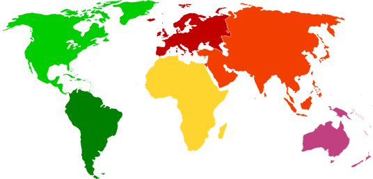
Apparently Wikipedia didn't want to include Antarctica in the continents map so we'll be working with 6 instead of 7! Oh well, the important lesson here is CSS image maps, not geography. 
What we're going to do is create an unordered list and use our map-color.png as its background-image. Fire up your text-editor of choice and create a new html document with the following markup in it:
<ul id="continents">
    <li id="northamerica"><a href="http://en.wikipedia.org/wiki/North_America">North America</a></li>
    <li id="southamerica"><a href="http://en.wikipedia.org/wiki/South_America">South America</a></li>
    <li id="asia"><a href="http://en.wikipedia.org/wiki/Asia">Asia</a></li>
    <li id="australia"><a href="http://en.wikipedia.org/wiki/Australia">Australia</a></li>
    <li id="africa"><a href="http://en.wikipedia.org/wiki/Africa">Africa</a></li>
    <li id="europe"><a href="http://en.wikipedia.org/wiki/Europe">Europe</a></li>
</ul>
What we have here is a simple unordered list containing our 6 continents and links to their information on wikipedia.org.
Let's add some basic styles to our ul element.
ul#continents {
 list-style: none;
 background: url(images/map-color.png) no-repeat 0 0;
 position: relative;
 width: 580px;
 height: 268px;
 margin: 0;
 padding: 0;
}
Some basic styles here, nothing special. We removed the list-style, added a background image, declared its width and height to be the same as our background image, and reset the margins and padding. The important declaration to pay attention to here is its position value of relative. This will allow for us to absolutely position our li elements next. You should have something like this.
Now we need to position our li elements according to their size and location on the continents map.
To make it easier for positioning our li elements, I recommend adding a 1px border to each li element, to guide us as a wireframe. We can remove the border when we're done positioning our li elements. Also, because all of our li elements will have this border AND also have a position value of absolute, rather than repeating ourself on each element's declarations, let's add them to all the li elements in our unordered list. Below your ul#continents styles add the following styles:
ul#continents li {
 border: 1px solid #000;
 position: absolute;
}
If you look at the page now, you'll see all of our li elements all bunched up in the left hand corner, overlapping one another. This is because they all have an absolute position, but there aren't any left, top, right, or bottom property values declared yet. We'll do that next.
Right below the ul#continents li styles, add the following styles:
#northamerica {
 width: 227px;
 height: 142px;
 top: 2px;
 left: 0px;
}

#southamerica {
 width: 108px;
 height: 130px;
 top: 131px;
 left: 76px;
}

#africa {
 width: 120px;
 height: 140px;
 top: 83px;
 left: 209px;
}

#europe {
 width: 120px;
 height: 84px;
 top: 1px;
 left: 211px;
}

#asia {
 width: 215px;
 height: 175px;
 top: 1px;
 left: 283px;
}

#australia {
 width: 114px;
 height: 95px;
 top: 152px;
 left: 432px;
}
All we did was give each li element its respected height and width values, and also positioned each of them using the left and top properties.
Now if you take a look at our page, you'll see a nice little wireframe of our image map. This is where the borders come in handy for fine tuning the positions. I think it looks good where it is, let's move on!
Right now, our li elements are only "clickable" within the text area of each anchor element. We want our entire li element to be clickable, so we need to add some styles to our anchor elements. I've highlighted the new styles needed.
ul#continents {
 list-style: none;
 background: url(images/map-color.png) no-repeat 0 0;
 position: relative;
 width: 580px;
 height: 268px;
 margin: 0;
 padding: 0;
}

ul#continents li {
 border: 1px solid #000;
 position: absolute;
}

ul#continents li a{
 display: block;
 height: 100%;
 text-indent: -9000px;
}

#northamerica {
 width: 227px;
 height: 142px;
 top: 2px;
 left: 0px;
}

#southamerica {
 width: 108px;
 height: 130px;
 top: 131px;
 left: 76px;
}

#africa {
 width: 120px;
 height: 140px;
 top: 83px;
 left: 209px;
}

#europe {
 width: 120px;
 height: 84px;
 top: 1px;
 left: 211px;
}

#asia {
 width: 215px;
 height: 175px;
 top: 1px;
 left: 283px;
}

#australia {
 width: 114px;
 height: 95px;
 top: 152px;
 left: 432px;
}
First thing we did was declare our display property value as block, instead of its default of inline, allowing for us to give it a height value, in which case we're giving it a value of 100%. We also gave it a negative text-indent value, because we want our text to only exist if CSS is disabled, otherwise we don't want it shown on our image map. Take a look at our page now, and hover over our "hotspots". You'll notice now that our hotspots include our entire li element now.
That's it! You can now remove the border values from your li elements and you'll have a simple CSS image map.
Not only is the markup cleaner, and easier to read, but, it's also a lot easier to make modifications to. For instance, if we went in and added Antarctica to the map, we'd simply need to create another li element and position it accordingly.
Add hover states to our map
So far we have demonstrated how to implement a simple image map using CSS, but, from a presentational standpoint, there doesn't seem to be much of a difference between the two image maps (table based vs. CSS). Where CSS image maps stand out is the ability to use a CSS background image sprite to add hover states to our image map.
I used another map from wikipedia to create a simple image sprite.
map.png
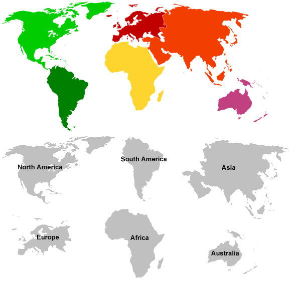
As you can see, I created a new image called map.png. I'm going to replace the map-color.png in my ul#continents styles with my new sprite image.
ul#continents {
 list-style: none;
 background: url(images/map.png) no-repeat 0 0;
 position: relative;
 width: 580px;
 height: 268px;
 margin: 0;
 padding: 0;
}
If you were to look at your page with the new background image, you wouldn't see a difference. What we need to do is add background image to our anchor elements, but only when they are hovered. What we're going to do is use the same background image as our ul#continents element on our anchor elements when they are hovered. We'll then need to position the background image according to its position within the sprite.
Let's go ahead and start with North America. At the bottom of your styles, add the following CSS rules:
ul#continents li a:hover {
 background: url(images/map.png) no-repeat 0 0;
}

ul#continents li#northamerica a:hover {
 background-position: 0 -270px;
}
What we've done is added our background image (map.png) to all of our anchor elements within the continents unordered list. We then declared the background position on our anchor element inside of the li#northamerica. If you take a look at our image map now, you'll see when you hover North America, it has a nice little hover state letting you know you're hovering over North America. If you hover the other continents, you'll see a piece of the the colored version of North America, because we haven't changed their background-positions yet. We'll do that now.
Below the last CSS rules you just put in your styles, go ahead and add the rest of the background position values.
ul#continents li#southamerica a:hover {
 background-position: -226px -273px;
}

ul#continents li#africa a:hover {
 background-position: -209px -417px;
}

ul#continents li#europe a:hover {
 background-position: -22px -427px;
}

ul#continents li#asia a:hover {
 background-position: -363px -268px;
}

ul#continents li#australia a:hover {
 background-position: -412px -455px;
}
Take a look at our image map now, and you'll see the background positions itself accordingly, when you hover over each continent.
How easy was that?! That's a nice little image map, with minimal markup, done 100% with CSS, and no javascript.
Create a "tooltip" like pop-up when hovering our continents
By now, you should probably have a pretty good feeling about CSS image maps and how to implement them. What we're going to do now is take it one step further and create a "tooltip" like pop-up to each of our continents when they are hovered. First thing we need to do is remove the negative text-indent declaration from our anchor elements.
ul#continents {
 list-style: none;
 background: url(images/map.png) no-repeat 0 0;
 position: relative;
 width: 580px;
 height: 268px;
 margin: 0;
 padding: 0;
}

ul#continents li {
 position: absolute;
}

ul#continents li a{
 display: block;
 height: 100%;

}
Now when you view your image map, you'll notice that all the country named anchors are visible again. We're going to take care of that now.
In the HTML of our image map, wrap the text content of each of our anchor elements in a <span> tag. So our html in the body should now look like this:
<ul id="continents">
    <li id="northamerica"><a href="http://en.wikipedia.org/wiki/North_America"><span>North America</span></a></li>
    <li id="southamerica"><a href="http://en.wikipedia.org/wiki/South_America"><span>South America</span></a></li>
    <li id="asia"><a href="http://en.wikipedia.org/wiki/Asia"><span>Asia</span></a></li>
    <li id="australia"><a href="http://en.wikipedia.org/wiki/Australia"><span>Australia</span></a></li>
    <li id="africa"><a href="http://en.wikipedia.org/wiki/Africa"><span>Africa</span></a></li>
    <li id="europe"><a href="http://en.wikipedia.org/wiki/Europe"><span>Europe</span></a></li>
</ul>
If you look at our image map now, you won't see any changes in our layout. Now, as I said, we only want text to show when we hover over one of our continents. So what we need to do is hide our span elements until our anchor element has been hovered. We will do this by using the display property.
Add the following CSS rules at the bottom of your styles:
ul#continents li a span {
 display: none;
}

ul#continents li a:hover span {
 display: block;
}
What we're telling the browser to do is hide all span elements (display: none) until its parent anchor element is hovered, in which, it will change from display: none to display: block.
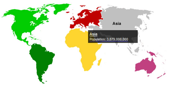
Take a look at our image map now and hover each continent. You'll now see the text will only show when its parent anchor element has been hovered. Let's make this thing look better, and add some useful information to the span elements, rather than just the country's name.
Note: I changed the way my HTML markup looks in the unordered list code for readability, it will not render the page any differently.
<ul id="continents">
    <li id="northamerica">
        <a href="http://en.wikipedia.org/wiki/North_America">
            <span>
                <strong>North America</strong>
                Population: 528,720,588
            </span>
        </a>
    </li>
    <li id="southamerica">
     <a href="http://en.wikipedia.org/wiki/South_America">
            <span>
                <strong>South America</strong>
                Population: 385,742,554
            </span>
        </a>
    </li>
    <li id="asia">
     <a href="http://en.wikipedia.org/wiki/Asia">
            <span>
                <strong>Asia</strong>
                Population: 3,879,000,000
            </span>
        </a>
    </li>
    <li id="australia">
     <a href="http://en.wikipedia.org/wiki/Australia">
            <span>
                <strong>Australia</strong>
                Population: 21,807,000
            </span>
        </a>
    </li>
    <li id="africa">
        <a href="http://en.wikipedia.org/wiki/Africa">
        <span>
            <strong>Africa</strong>
            Population: 922,011,000
        </span>
        </a>
    </li>
    <li id="europe">
        <a href="http://en.wikipedia.org/wiki/Europe">
            <span>
                <strong>Europe</strong>
                Population: 731,000,000
            </span>
        </a>
    </li>
</ul>
What we've done is wrap <strong> tags around our each of our continents' names and added each of their respected population counts.
Now we need to add some styles to our new elements and we're done. First thing we want to do is remove the underline from our anchor elements. Go ahead and find your ul#continents li a rules in your styles and add the highlighted style declaration.
ul#continents li a{
 display: block;
 height: 100%;
 text-decoration: none;
}
Now we need to add some more rules to our span elements. Add the highlighted styles.
ul#continents li a:hover span {
 display: block;
 padding: 5px;
 width: 150px;
 background: #000;
 position: relative;
 top: 50%;
 font: 11px Arial, Helvetica, sans-serif;
 opacity: .75;
 filter:alpha(opacity=75);
 color: #FFF;
}
What we're doing here is giving our span elements (when they're parent anchor element is hovered) some styles to make our content look a little better and more like a tooltip.
Final Thoughts
That's it! Now, you should have a pretty good understanding of how CSS image maps work. You should be able to take this knowledge and use it into your own projects, or even extend its use by implementing your own ideas.
You might also like


Recommend Items
Tags
accordion accordion menu animation navigation animation navigation menu carousel checkbox inputs css3 css3 menu css3 navigation date picker dialog drag drop drop down menu drop down navigation menu elastic navigation form form validation gallery glide navigation horizontal navigation menu hover effect image gallery image hover image lightbox image scroller image slideshow multi-level navigation menus rating select dependent select list slide image slider menu stylish form table tabs text effect text scroller tooltips tree menu vertical navigation menu