 Subscribe
 Follow Us
Sliding up form labels with jquery and CSS3
 13 years ago
 16285
16285 3064
3064
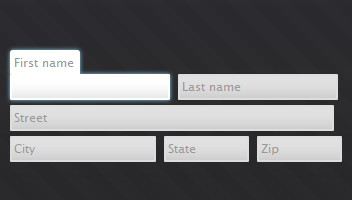
A common problem for laying out a labels and their inputs is that the labels dangle out in what appears to be whitespace. Form labels can make a design aesthetically awkward. There are several paths to solving this, but here I will follow the path of placing the label inside the text input element.
efore showing demoing compact-labels, a recap of the issues:
- Awkward placement of the label with extra whitespace
- The label disappears before the user gets to read it
- The label is gone once a value is inputted
The CSS
  .compactlabel-wrapper {
   display: inline-block;
   position: relative;
  }

  .compactlabel-wrapper-on {
   z-index: 5;
  }

  .compactlabel-wrapper label {
   position: absolute;
   z-index: 4;
  }

  .compactlabel-wrapper label.compactlabel-hide {
   z-index: 2;
  }

  .compactlabel-wrapper input {
   position: relative;
   z-index: 3;
  }

  .compactlabel-label-backing {
   position: absolute;
   z-index: 1;
  }

  /* personalized styles */
  .compactlabel-label-backing {
   padding: 2px 3px 4px 3px;
   border-style: solid;
   border-width: 2px 2px 0 2px;
   -moz-border-radius-topleft: 3px;
   -moz-border-radius-topright: 3px;
   background-color: #e0e0e0;
   -webkit-transition: 1s background-color;

  }

  .compactlabel-wrapper label {
   font-family: "Lucida Sans Unicode", "Lucida Sans", "Lucida Grande", Arial, sans-serif;
   color: #999;
   padding: 4px;
   font-size: 80%;
   font-size: 12px;
  }


  .compactlabel-wrapper-on,
  .compactlabel-wrapper-on .compactlabel-label-backing {
   -moz-box-shadow: SkyBlue 0 0 5px;
   -webkit-box-shadow: SkyBlue 0 0 5px;
   box-shadow: SkyBlue 0 0 5px;
  }

  input[type=text] {
   padding: 3px;
   margin: 0;
   border: solid #ddd 2px;
   background-color: #e0e0e0;
   font-family: "Lucida Sans Unicode", "Lucida Sans", "Lucida Grande", Arial, sans-serif;
   font-size: 12px;
   -moz-border-radius: 1px;
   -webkit-border-radius: 1px;
   border-radius: 1px;
   background-image: -moz-linear-gradient( 270deg, rgba(255,255,255,0), rgba(100,100,100,.15)  );
   -webkit-transition: 1s background-color, 1s border-color;
  }

  input[type=text] {
   background-image: -webkit-gradient(linear, left bottom, left top, to(rgba(255,255,255,0)), from(rgba(100,100,100,.15)));
   outline: none;
  }

  input[type=text]:hover,
  input[type=text]:focus,
  .compactlabel-wrapper-on input,
  .compactlabel-wrapper-on .compactlabel-label-backing {
   background-color: #fff;
   border-color: #fff;
  }

  form {
   position: absolute;
   left: 50%;
   top: 0px;
   bottom: 0;
   width: 360px;
   margin: 0 10px;
   padding: 150px 30px;
   background-color: #555;

   /*-moz-box-shadow: 0 0 50px #252525;
   -webkit-box-shadow: 0 0 5px rgba( 0, 0, 0, .5 );
   box-shadow: 0 0 5px rgba( 0, 0, 0, .5 );*/
   border: inset 2px rgba( 99, 99, 99, .02 );
  }

  form {
   background-color: rgba( 55, 55, 55, .01 );
   background-image: -moz-linear-gradient( 270deg, rgba( 55, 55, 55, 0 ), rgba( 55, 55, 55, .1 ) ), -moz-repeating-linear-gradient(top left 45deg, rgba(255,255,255,.008), rgba(255,255,255,.008) 15px, rgba(0,0,0,0) 15px, rgba(0,0,0,0) 30px);
  }
  form {
   background: -webkit-gradient(linear, left top, left bottom, from(rgba( 55, 55, 55, 0 )), from(rgba( 55, 55, 55, .1 )));
  }

  h1 {
   font-family: "Lucida Sans Unicode", "Lucida Sans", "Lucida Grande";
   font-weight: normal;
   color: #dddde0;
   font-size: 50px;
   text-shadow: -1px -1px 0 #111;
   line-height: 70%;
   position: absolute;
   right: 50%;
   top: 0;
   bottom: 0;
   padding: 130px 10px;
   text-shadow: rgba( 221, 221, 224, .5 ) 0 0 3px;
   border-right: solid rgba( 225,255,255,.02) 1px;
   border-left: solid rgba( 225,255,255,.02) 1px;
   background-color: rgba( 45,45,51,.1);
   margin: 0;
  }

  h1 a {
   display: block;
   font-size: 18px;
   color: #dddde0;
   text-decoration: none;
   opacity: .2;
   text-transform: lowercase;
   -webkit-transition: 2s opacity;

  }
  h1 a:hover {
   opacity: 1;
  }

  body {
   background-color: #222226;
   background-image: -moz-linear-gradient( 270deg, rgba(255,255,255,.05), rgba(255,255,255,0) );
   background-repeat: no-repeat;

   padding: 0;
   margin: 0;
   min-height: 100%;

   min-width: 900px;
   position: relative;

   -moz-box-shadow: inset 0 0 40px rgba(57,57,64,.5);

  }

  body {
   background-image: -webkit-gradient(linear, left top, left bottom, to(rgba(255,255,255,0)), from(rgba(255,255,255,.05)));
  }


  html {
   height: 100%;
  }

  #first-name,
  #last-name {
   width: 150px;
  }

  #street {
   width: 314px;
  }

  #city {
   width: 136px;
  }

  #state,
  #zip {
   width: 75px;
  }

  p {
   margin: 5px;
  }
Javascript
 jQuery( document ).ready( function( ){

  // For all the inputs that are text inputs
  jQuery( 'input:text' ).each( function( ){
   var $this = jQuery( this );

   // get the label
   var label = jQuery( 'label[for='+this.id+']' );

   // If no label, then return to avoid errors
   if( label.size( ) == 0 ){
    return;
   }

   // create wrapper element
   var wrapper = jQuery( '<div class="compactlabel-wrapper"></div>' );
   $this.wrap( wrapper );

   // move the label to before the the input
   $this.before( label );

   // create label backing
   var backing = jQuery( '<div class="compactlabel-label-backing"></div>' )
    .insertBefore( $this )
    .height( label.height( ) )
    .width( label.width( ) );

   // basic style information
   var labelOffset = label.position( ), inputOffset = $this.position( ), labelHeight = label.outerHeight( );

   // flag for if on or off
   var isHover = false, isFocus = false;

   // a jQuery object of the backing and label to animate both together
   var animatedElements = jQuery( backing.get( ) ).add( label.get( ) );


   // common functionality for hover on and focus on
   var on = function( event ){
    $this.parent( ).addClass( 'compactlabel-wrapper-on' );
    animatedElements.stop( ).animate( { "top": '-'+(labelHeight - inputOffset.top)+'px' } );

   };

   // common functionality for hover off and focus off
   var off = function( event ){
    if( isHover || isFocus ){
     return;
    }
    if( inputEmpty ){
     label.removeClass( 'compactlabel-hide' );
    } else {
     label.addClass( 'compactlabel-hide' );
    }

    if( !inputEmptyChange ){
     animatedElements.stop( );
    }

    animatedElements.animate(
     { "top": labelOffset.top + 'px' },
     function( ){
      $this.parent( ).removeClass( 'compactlabel-wrapper-on' )
     } );
   };

   var onHover = function( event ){
    isHover = true;
    on( event );
   };

   var offHover = function( event ){
    isHover = false;
    off( event );
   };

   var onFocus = function( event ){
    isFocus = true;
    on( event );
   };

   var offFocus = function( event ){
    isFocus = false;
    off( event );
   };

   // The pieces for keeping track if the value of the input is empty
   var inputEmpty = false, inputEmptyStart = false, inputEmptyChange = false;
   var checkInputEmpty = function( ){
    inputEmpty = $this.val( ) == '';
   };
   checkInputEmpty( );
   // ID for setTimeout for checkInputEmpty
   var checkInputEmptyFnID = null;


   if( !inputEmpty ){
    label.addClass( 'compactlabel-hide' );
   }

   // add the events
   // events to track if the value changed empty state
   $this.focus( function( ){
    inputEmptyStart = inputEmpty;
    inputEmptyChange = false;
    checkInputEmptyFnID = setInterval( checkInputEmpty, 50 );
   } );

   $this.blur( function( ){
    clearInterval( checkInputEmptyFnID );
    checkInputEmpty( );
    inputEmptyChange = inputEmptyStart != inputEmpty;
   } );

   // animation events
   $this.focus( onFocus );
   $this.blur( offFocus );
   $this.hover( onHover, offHover );
   label.hover( onHover, offHover );

  } );
 } );
You might also like
Tags
accordion accordion menu animation navigation animation navigation menu carousel checkbox inputs css3 css3 menu css3 navigation date picker dialog drag drop drop down menu drop down navigation menu elastic navigation form form validation gallery glide navigation horizontal navigation menu hover effect image gallery image hover image lightbox image scroller image slideshow multi-level navigation menus rating select dependent select list slide image slider menu stylish form table tabs text effect text scroller tooltips tree menu vertical navigation menu