 Subscribe
 Follow Us
jQuery Smooth Circular Motion Menu
 14 years ago
 21470
21470 4103
4103

we are going to create a stunning circular motion effect with jQuery. We will be using the jQuery.path plugin to animate a circular movement for a menu in a portfolio example.
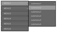
The idea is to have a rounded content area with a main menu. When hovering over one of the menu items, a sub-menu element appears, circulating around the content area.
The Markup
The HTML consists of a wrapper that contains the images for the content area and an element for the big content circle. The main menu is inside of the big content circle. Then we define the structure for the three small circles that will appear when hovering over the menu items:
<div class="wrapper">
 <div id="images" class="images">
  <img id="image_about" src="images/1.png" alt="1" style="display:block;"/>
  <img id="image_portfolio" src="images/2.png" alt="2"/>
  <img id="image_contact" src="images/3.png" alt="3"/>
 </div>
 <div class="circleBig">
  <div id="menu" class="menu">
   <a id="about" class="about" href="">About me</a>
   <a id="portfolio" class="portfolio" href="">Portfolio</a>
   <a id="contact" class="contact" href="">Contact</a>
  </div>
 </div>
</div>
<div id="circle_about" class="circle">
 <div class="description">
  <ul>
   <li><a href="#">Who I am</a></li>
   <li><a href="#">What I do</a></li>
   <li><a href="#">My CV</a></li>
  </ul>
 </div>
</div>
<div id="circle_portfolio" class="circle">
 <div class="description">
  <div class="thumbs">
   <a href="#"><img src="thumbs/1.jpg" alt=""/></a>
   <a href="#"><img src="thumbs/2.jpg" alt=""/></a>
   ...
  </div>
 </div>
</div>
<div id="circle_contact" class="circle">
 <div class="description">
  <ul>
   <li><a href="#">Email</a></li>
   <li><a href="#">Twitter</a></li>
   <li><a href="#">Facebook</a></li>
  </ul>
 </div>
</div>
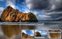
In two of the three smaller circles we will have a link list. The other circle contains some images.
The CSS
We will position most of the elements absolutely since that will make things a lot easier applying the jQuery.path plugin. Let’s start with the style of the first elements:
.wrapper{
    font-family: Verdana;
    font-size:11px;
    width:600px;
    height:600px;
    position:relative;
    top:150px;
    left:200px;
}
.images img{
    display:none;
    position:absolute;
    left:6px;
    top:6px;
}
.circleBig{
    position:absolute;
    top:0px;
    left:0px;
    width:418px;
    height:418px;
    background:transparent url(../images/circlebg.png) no-repeat top left;
}
For the main menu we will be using CSS sprites:
.menu{
    position:absolute;
    width:101px;
    height:74px;
    top:240px;
    left:260px;
    z-index:999;
}
a.about, a.portfolio, a.contact{
    float:left;
    clear:both;
    height:23px;
    margin-bottom:10px;
    width:105px;
    text-indent:-2000000px;
    opacity:0.8;
    background:transparent url(../images/menu.png) no-repeat top left;
}
a.portfolio{
    width:90px;
    background-position:-105px 0px;
}
a.contact{
    width:88px;
    background-position:-199px 0px;
}
a.about:hover, a.portfolio:hover, a.contact:hover{
    opacity:1.0;
}
The circle needs to be positioned correctly for the usage of the jQuery.path plugin. So we need to “pull” it into place by adding a negative margin of half of the width, or height, respectively.
.circle{
    margin-top:-88px;
    margin-left:-88px;
    width:176px;
    height:176px;
    position:absolute;
    left:0;
    top:0;
    background:transparent url(../images/circle.png) no-repeat top left;
    z-index:10;
    opacity:0;
    filter:progid:DXImageTransform.Microsoft.Alpha(opacity=0);
}
The style for the descriptions inside of the small circle will be as follows:
.description{
    width:120px;
    margin:40px auto;
    text-align:center;
}
.description ul{
    list-style:none;
    text-align:center;
}
.description ul a{
    line-height:30px;
    font-weight:bold;
    color:#fff;
    text-decoration:none;
    text-transform:uppercase;
    font-size:11px;
    text-shadow:1px 1px 1px #aaa;
}
.description ul a:hover{
    color:#f0f0f0;
}
.thumbs a img{
    border:3px solid #f9f9f9;
    -moz-box-shadow:1px 1px 2px #999;
    -webkit-box-shadow:1px 1px 2px #999;
    box-shadow:1px 1px 2px #999;
}
Text-shadow and box-shadow are CSS3 properties that will not work in any IE browser.
OK, let’s add the magic.
The JavaScript
In order to use the jQuery.path plugin we need to define the center and radius of the imaginary circle that will be used for the rotation of the small circle. In our case the imaginary circle is the bigger circle, the “circleBig” class image. The following formula gives us the center coordinates:
center x = Absolute left of circleBig + radius of circleBig
center y = Absolute top of circleBig + radius of circleBig
radius r = Width circleBig / 2
$(function() {

 /* when page loads animate the about section by default */
 //move($('#about'),2000,2);

 $('#menu > a').mouseover(
  function(){
   var $this = $(this);
   move($this,800,1);
  }
 );

 /*
 function to animate / show one circle.
 speed is the time it takes to show the circle
 turns is the turns the circle gives around the big circle
  */
 function move($elem,speed,turns){
  var id = $elem.attr('id');
  var $circle = $('#circle_'+id);

  /* if hover the same one nothing happens */
  if($circle.css('opacity')==1)
   return;

  /* change the image */
  $('#image_'+id).stop(true,true)
        .fadeIn(650)
        .siblings()
        .not(this)
        .fadeOut(650);

  /*
  if there's a circle already, then let's remove it:
  either animate it in a circular movement or just fading
  out, depending on the current position of it
   */
  $('#content .circle').each(function(i){
   var $theCircle = $(this);
   if($theCircle.css('opacity')==1)
    $theCircle.stop()
   .animate({
    path : new $.path.arc({
     center : [409,359],
     radius : 257,
     start : 65,
     end     : -110,
     dir : -1
    }),
    opacity: '0'
   },1500);
   else
    $theCircle.stop()
   .animate({opacity: '0'},200);
  });

  /* make the circle appear in a circular movement */
  var end = 65 - 360 * (turns-1);
  $circle.stop()
  .animate({
   path : new $.path.arc({
    center : [409,359],
    radius : 257,
    start : 180,
    end  : end,
    dir  : -1
   }),
   opacity: '1'
  },speed);
 }
});
You might also like


Tags
accordion accordion menu animation navigation animation navigation menu carousel checkbox inputs css3 css3 menu css3 navigation date picker dialog drag drop drop down menu drop down navigation menu elastic navigation form form validation gallery glide navigation horizontal navigation menu hover effect image gallery image hover image lightbox image scroller image slideshow multi-level navigation menus rating select dependent select list slide image slider menu stylish form table tabs text effect text scroller tooltips tree menu vertical navigation menu