 Subscribe
 Follow Us
Stylish Tabs Content Slider with CSS3 and jQuery
 13 years ago
 23735
23735 5179
5179
it in Safari 5.0.2, Chrome 6.0.472.62 and Firefox 3.6.3 it displayed ok in all 3 browsers (Mac OS X 10.6.4) all the effects rendered fine.in Opera the tabs don't render, but the layout is still functional.
we sometimes have to resort to using different techniques in order to show/hide/group some content or information on a web page.
Content sliders are very popular because they work and usually don’t hinder usability and in many cases can even improve the user experience. Today we’ll learn how to create a stylish content slider using CSS3 and some jQuery magic
HTML
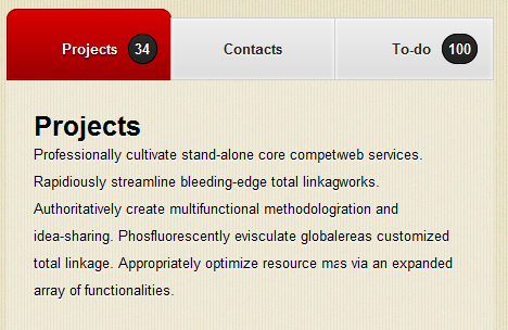
Let’s start with the HTML. First we’re going to create an unordered list, with four list-items and wrap it all in a div with the id ‘navbar’. Three list-items should have the class ‘inactive’ and one (the active one obviously) should have the ‘active’ class. Two logical choices to add notifications to are ‘Projects’ and ‘To-do’, so create a span with the class ‘notification’ after the link text.
<html>
<head>
<meta http-equiv="Content-Type" content="text/html; charset=utf-8" />
<title>Stylish CSS3 & jQuery Content Slider</title>
<link rel="stylesheet" type="text/css" href="style-slider.css" />
</head>
<body>
<div id="navbar">
<ul>
<li class="active"><a href="#" title="Projects">Projects<span class="notification">34</span></a></li>
<li class="inactive"><a href="#" title="Contacts">Contacts</a></li>
<li class="inactive"><a href="#" title="Earnings">Earnings</a></li>
<li class="inactive"><a href="#" title="To-do">To-do<span class="notification">100</span></a></li>
</ul>
</div>
</body>
</html>
Now open up another div, this time with the id ‘slider’. In here you’ll add some content, e.g four headers in ‘h2’ tags and some text in ‘p’ tags after each header. (You can change the text, but don’t change the tags since that’s what we’re going to use to create the slider. If you do add more tags (e.g 5 ‘h2’ tags) you have to have 5 list-items.
<div id="slider">
    <h2>Projects</h2>
    <p>Professionally cultivate stand-alone core competencies whereas distributed web services. </p>
    <h2>Contacts</h2>
    <p>Professionally cultivate stand-alone core competencies whereas distributed web services. Rapidiously streamline bleeding-edge total linkage after multidisciplinary networks. </p>
    <h2>Earnings</h2>
    <p>Professionally cultivate stand-alone core competencies whereas distributed web services. Rapidiously streamline bleeding-edge total linkage after multidisciplinary networks. Authoritatively create multifunctional methodologies through premier collaboration and idea-sharing. </p>
    <h2>To-do</h2>
    <p>Professionally cultivate stand-alone core competencies whereas distributed web services. Rapidiously streamline bleeding-edge total linkage after multidisciplinary networks. Authoritatively create multifunctional methodologies through premier collaboration and idea-sharing. Phosfluorescently evisculate global manufactured products whereas customized total linkage. Appropriately optimize resource maximizing core competencies via an expanded array of functionalities.</p>
</div>
That was quick? At the moment it should look like this. Now we’ll add some style to the whole thing.
CSS
If you like you can use Eric Meyer’s CSS reset, but in our case this should be enough.
* {
    margin: 0;
    padding: 0;
}

body {
    font-family: helvetica, tahoma, Sans-serif;
    font-size: 13px;
    background: url(images/bg.jpg) repeat;
}
Set the margin and padding to 0 (using ‘*’), the font stack to helvetica/tahoma/sans-serif, the font size to 13px and the background to the image on the right → (using the body tag). Make sure you set it to repeat, meaning it won’t display only once, instead it will be repeated horizontally and vertically across the entire page.
Style the links, just add text-decoration: none. In case you have any links in your content part, you may want to add color , etc.
a {
    text-decoration: none;
}
Next we’ll style the h2 and paragraph tags. Nothing really hard there except for maybe the text-shadow. The first value is the x-offset, the second is the y-offset, the third is the blur and the last value is the color.
h2 {
    font-family: Helvetica, tahoma, Sans-serif;
    font-size: 25px;
    font-weight: bold;
    text-shadow: 0 1px 1px white;
}

p {
    text-shadow: 0 1px 1px white;
}
Next, the navbar div. The width is set to 650px, and margins (top, right, bottom, left) are 20px, 0, 0 and 40px. I personally think that bold font looks better here, but that’s just my opinion :)
#navbar {
    margin: 20px 0 0 40px;
    width: 650px;
    font-weight: bold;
}
All unordered list items should display as an inline block. The ul li a (unordered list-items links) position is set to relative. They should display as a block, have a set width of 150px and text should be aligned in the center. By setting a width and aligning the text in the center, we can assure all list-items have the same width.
ul li{
    display: inline-block;
}

ul li a {
    position: relative;
    display: block;
    width: 150px;
    text-align: center;
}
Now to the active state of the links. Here I’m using bunches of CSS3, which isn’t supported by all browsers.
Two things: I recently discovered ‘-webkit-background-clip: padding-box’ via Sneak. Try comparing the border radius with and without the background clip, you’ll definitely notice the difference. Z-index is used to determine the order of overlapping objects, the highest number is at the top.
To remove the ugly outline when clicked on, set the outline of the ‘:focus’ pseudo class to none.
.active a{
    padding: 28px 0 20px 0;
    background: -webkit-gradient(linear, left top, left bottom, from(#db0000), to(#9b0000));
    background: -moz-linear-gradient(top center, #db0000, #9b0000);
    border: 1px solid #8d0000;
    text-shadow: 0 1px 1px black;
    -webkit-border-radius: 10px 10px 0 0;
    -webkit-background-clip: padding-box;
    -webkit-box-shadow: inset 0 0 1px #fd0000;
    -moz-border-radius: 10px 10px 0 0;
    -moz-background-clip: padding-box;
    -moz-box-shadow: inset 0 0 1px #fd0000;
    margin-left: -5px;
    z-index: 2;
    color: white;
    text-shadow: 0 1px 1px black;
}

.active a:focus {
    outline: none;
}
Next up: inactive class. The inactive class is similar to the active class, just less padding, a different gradient and no border radius. This time the z-index is 1, since the active button should display above the inactive buttons. Here too, set the outline of the ‘:focus’ pseudo class to none.
.inactive a:hover {
    background: -webkit-gradient(linear, left bottom, left top, from(#eee), to(#ddd));
    background: -moz-linear-gradient(top center, #ddd, #eee);
}

.inactive a {
    color: #222;
    text-shadow: 0 1px 1px white;
    background: -webkit-gradient(linear, left top, left bottom, from(#eee), to(#ddd));
    background: -moz-linear-gradient(top center, #eee, #ddd);
    -webkit-box-shadow: inset 0 0 5px white;
    -moz-box-shadow: inset 0 0 5px white;
    padding: 20px 0;
    -webkit-box-shadow: inset 0 0 5px white;
    -moz-box-shadow: inset 0 0 5px white;
    border: 1px solid #ccc;
    margin-left: -5px;
    z-index: 1;
}

.inactive a:focus {
    outline: none;
}
Almost done (with the style anyway). You can leave out the notifications, but I think they look good, that’s why I’ve added them. Be sure to set the min-width to 15px so they can’t get any smaller than a perfect circle, and add a margin-left to add some distance between the link text and the circle.
span.notification {
    position: absolute;
    padding: 5px;
    margin-top: -6px;
    color: white;
    min-width: 15px;
    text-align: center;
    border: 1px solid #000;
    background: -webkit-gradient(linear, left top, left bottom, from(#2a2a2a), to(#222));
    background: -moz-linear-gradient(top center, #2a2a2a, #222);
    -webkit-box-shadow: inset 0 0 1px #333;
    -moz-box-shadow: inset 0 0 1px #333;
    text-shadow: 0 -1px 1px black;
    -webkit-border-radius: 50px;
    -moz-border-radius: 50px;
    margin-left: 10px;
}
The slider is a div which contains all text content. Set the width to 555px. If you somehow change the width of the list-elements you have to change this value (555px) too. I set the background to ‘rgba(255,255,255,0.3)’. This may be new to some of you. The first three values (separated by commas) is the RGB value of the color (e.g white -> #fff -> 255,255,255). The last value is the opacity, from 0 (invisible) to 1 (100% opacity). If you know the hex value of a color, but not the RGB value (or vice versa) you can use this helpful app called Hex-to-RGB Conversion.
#slider {
    width: 555px;
    background: rgba(250,250,250,0.3);
    padding: 30px 25px 30px 25px;
    line-height: 25px;
    margin-left: 35px;
}
jQuery
Now your design should be looking pretty good, but there’s one problem: try clicking on a link. Does it work? No, I thought so. This is where jQuery comes in. A friend introduced me to this (fabulous, awesome, incredible…) javascript framework and I’ve using it ever since. I’m still a novice, but this code is pretty simple.
In your head section, import Google’s jQuery library and create two script tags to insert your code (directly before the header closing tag).
<script src="http://ajax.googleapis.com/ajax/libs/jquery/1.4.1/jquery.min.js" type="text/javascript"></script>

<script type="text/javascript">

</script>
We’ll start out with document -> ready -> function. What this tells the browser is that once the document has loaded, execute the function inside the curly brackets.
$(document).ready(function(){
});
Next we’ll create the click function. When the user clicks on a ‘li’ element, the following function is performed.
$('li').click(function(){
});
First, assign the variable ‘number’ to this’ index. ‘This’ is the ‘li’ element we clicked on. Since we don’t have different classes for each list-item, ‘.index()’ gets which position the item has (starting with 0. e.g I click on the second list-item (contacts) and index would return ‘1’).
$('li').click(function(){
 var number = $(this).index();
});
We’ll continue with this:
$('li').click(function(){
 var number = $(this).index();
 $('h2').hide().eq(number).show();
 $('p').hide().eq(number).show();
});
This piece of code is quite simple. It selects all ‘h2’ (respectively ‘p’) elements and hides them, except if their position (eq) is equal to that of ‘this’ (var number), meaning it shows them. The jQuery docs page does a great job at explaining this by the way.
Next we’ll toggle the classes of the list-item (still ‘this’) clicked on with toggleClass, remove the active class and add the inactive class to all ‘li’s that are not ‘this’. After that we can close the click function.
$('li').click(function(){
 var number = $(this).index();
 $('h2').hide().eq(number).show();
 $('p').hide().eq(number).show();
 $(this).toggleClass('active inactive');
 $('li').not(this).removeClass('active').addClass('inactive');
});
Finally we’ll select all h2 (and p) elements that aren’t the first of their kind and hide them. This will only be executed once, and only to make sure only the ‘Projects’ heading and paragraph text is displayed
$(document).ready(function(){
 $('li').click(function(){
  var number = $(this).index();
  $('h2').hide().eq(number).show();
  $('p').hide().eq(number).show();
  $(this).toggleClass('active inactive');
  $('li').not(this).removeClass('active').addClass('inactive');
 });

 $('h2').not(':first').hide();
 $('p').not(':first').hide();

});
Well, we’re done.
You might also like
Tags
accordion accordion menu animation navigation animation navigation menu carousel checkbox inputs css3 css3 menu css3 navigation date picker dialog drag drop drop down menu drop down navigation menu elastic navigation form form validation gallery glide navigation horizontal navigation menu hover effect image gallery image hover image lightbox image scroller image slideshow multi-level navigation menus rating select dependent select list slide image slider menu stylish form table tabs text effect text scroller tooltips tree menu vertical navigation menu