 Subscribe
 Follow Us
Multicolor tooltips CSS3
 12 years ago
 15009
15009 3945
3945
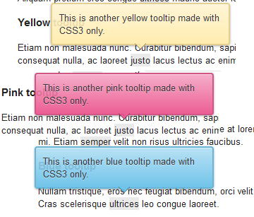
If your icon or button has insufficient text or none at all, or it just needs some additional explanation, then you surely need a tooltip for it. Why’s that? Because, as they have proved till now, tooltips can help you improve your website usability.
It is created own CSS tooltips: no images, no javascript.
HTML
<a href="#" class="tooltip">
  your text
  <span>Your tooltip description</span>
</a>
Why an anchor?
Just for compatibility reasons. IE6 has a problem with the :hover pseudo-class used with other elements than anchor.
If you want to use these tooltips, and anchors are not an option for you, then you can use this to trigger the tooltip for IE6:
<script type="text/javascript" src="http://code.jquery.com/jquery-latest.min.js"></script>
<script type="text/javascript">
  $(function() {
    if ($.browser.msie && $.browser.version.substr(0,1)<7)
    {
      $('.tooltip').mouseover(function(){
            $(this).children('span').show();
          }).mouseout(function(){
            $(this).children('span').hide();
          })
    }
  });
</script>
CSS
.tooltip
{
  position: relative;
  background: #eaeaea;
  cursor: help;
  display: inline-block;
  text-decoration: none;
  color: #222;
  outline: none;
}

.tooltip span
{
  visibility: hidden;
  position: absolute;
  bottom: 30px;
  left: 50%;
  z-index: 999;
  width: 230px;
  margin-left: -127px;
  padding: 10px;
  border: 2px solid #ccc;
  opacity: .9;
  background-color: #ddd;
  background-image: -webkit-linear-gradient(rgba(255,255,255,.5), rgba(255,255,255,0));
  background-image: -moz-linear-gradient(rgba(255,255,255,.5), rgba(255,255,255,0));
  background-image: -ms-linear-gradient(rgba(255,255,255,.5), rgba(255,255,255,0));
  background-image: -o-linear-gradient(rgba(255,255,255,.5), rgba(255,255,255,0));
  background-image: linear-gradient(rgba(255,255,255,.5), rgba(255,255,255,0));
  -moz-border-radius: 4px;
  border-radius: 4px;
  -moz-box-shadow: 0 1px 2px rgba(0,0,0,.4), 0 1px 0 rgba(255,255,255,.5) inset;
  -webkit-box-shadow: 0 1px 2px rgba(0,0,0,.4), 0 1px 0 rgba(255,255,255,.5) inset;
  box-shadow: 0 1px 2px rgba(0,0,0,.4), 0 1px 0 rgba(255,255,255,.5) inset;
  text-shadow: 0 1px 0 rgba(255,255,255,.4);
}

.tooltip:hover
{
  border: 0; /* IE6 fix */
}

.tooltip:hover span
{
  visibility: visible;
}

.tooltip span:before,
.tooltip span:after
{
  content: "";
  position: absolute;
  z-index: 1000;
  bottom: -7px;
  left: 50%;
  margin-left: -8px;
  border-top: 8px solid #ddd;
  border-left: 8px solid transparent;
  border-right: 8px solid transparent;
  border-bottom: 0;
}

.tooltip span:before
{
  border-top-color: #ccc;
  bottom: -8px;
}
The article source:http://www.red-team-design.com/css3-tooltips
You might also like


Tags
accordion accordion menu animation navigation animation navigation menu carousel checkbox inputs css3 css3 menu css3 navigation date picker dialog drag drop drop down menu drop down navigation menu elastic navigation form form validation gallery glide navigation horizontal navigation menu hover effect image gallery image hover image lightbox image scroller image slideshow multi-level navigation menus rating select dependent select list slide image slider menu stylish form table tabs text effect text scroller tooltips tree menu vertical navigation menu