 Subscribe
 Follow Us
graceful CSS or MooTools Photo Stack Animations Effect
 12 years ago
 10631
10631 1909
1909
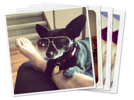
My favorite technological piece of Google Plus is its image upload and display handling. You can drag the images from your OS right into a browser's DIV element, the images upload right before your eyes, and the albums page displays a sexy photo deck animation when you hover over them. Outstanding! I've researched the effect a bit and was able to pull it off with both pure CSS and some MooTools JavaScript.
Initial Setup
The HTML setup is quite simple:
<a href="" class="album">
  <img src="http://davidwalsh.name/dw-content/gplus/photo4.png" class="photo1" />
  <img src="http://davidwalsh.name/dw-content/gplus/photo1.png" class="photo2" />
  <img src="http://davidwalsh.name/dw-content/gplus/photo2.png" class="photo3" />
</a>
I've used an A elements so that we can also play the animation with focus via tab. With the images in place, we need to style the A and images themselves:
/* the A tag */
.album {
  position: relative;
  z-index: 5;
  width: 250px;
  vertical-align: top;
  display:block;
}

/* the images */
.album img {
  position: absolute;
  top: 0;
  left: 0;
  border: 5px solid #f3f3f3;
  box-shadow: 1px 1px 2px #666;
  -webkit-box-shadow: 1px 1px 2px #666;
  -moz-box-shadow: 1px 1px 2px #666;
  width:250px;
  height:250px;
  display:block;
}
These styles act as a base to the CSS and MooTools methods of animation.
The CSS Version
Both the CSS-only and MooTools versions will rely on browser-provided CSS3 animations via transforms. The transforms we'll be using are rotate, translate, and scale. The scale will be kept relatively small so that the magnification isn't abrupt.
The first step is getting our @-keyframes properties set up so that we can use the animations later. The following CSS assumes there will be 3 photos and user Google's animation values:
/* first image:  webkit */
@-webkit-keyframes image1 {
  0%   { -webkit-transform: rotate(0deg) translate(0, 0) scale(1.0); }
  100% { -webkit-transform: rotate(-6deg) translate(-100px, -3px) scale(1.1); }
}

/* first image:  firefox */
@-moz-keyframes image1 {
  0%   { -moz-transform: rotate(0deg) translate(0, 0) scale(1.0); }
  100% { -moz-transform: rotate(-6deg) translate(-100px, -3px) scale(1.1); }
}

/* first image:  opera */
@-o-keyframes image1 {
  0%   { -o-transform: rotate(0deg) translate(0, 0) scale(1.0); }
  100% { -o-transform: rotate(-6deg) translate(-100px, -3px) scale(1.1); }
}

/* second image:  webkit */
@-webkit-keyframes image2 {
  0%   { -webkit-transform: rotate(0deg) translate(0, 0) scale(1.0); }
  100% { -webkit-transform: rotate(0deg) translate(0, -3px) scale(1.1); }
}
/* second image:  firefox */
@-moz-keyframes image2 {
  0%   { -moz-transform: rotate(0deg) translate(0, 0) scale(1.0); }
  100% { -moz-transform: rotate(0deg) translate(0, -3px) scale(1.1); }
}
/* second image:  opera */
@-o-keyframes image2 {
  0%   { -o-transform: rotate(0deg) translate(0, 0) scale(1.0); }
  100% { -o-transform: rotate(0deg) translate(0, -3px) scale(1.1); }
}

/* third image:  webkit */
@-webkit-keyframes image3 {
  0%   { -webkit-transform: rotate(0deg) translate(0, 0) scale(1.0); }
  100% { -webkit-transform: rotate(6deg) translate(100px, -3px) scale(1.1); }
}

/* third image:  firefox */
@-moz-keyframes image3 {
  0%   { -moz-transform: rotate(0deg) translate(0, 0) scale(1.0); }
  100% { -moz-transform: rotate(6deg) translate(100px, -3px) scale(1.1); }
}

/* third image:  opera */
@-o-keyframes image3 {
  0%   { -o-transform: rotate(0deg) translate(0, 0) scale(1.0); }
  100% { -o-transform: rotate(6deg) translate(100px, -3px) scale(1.1); }
}
With the keyframes ready, it's time to implement the CSS settings within the selectors themselves:
/* first image animation properties */
.album:hover .photo1, .album:focus .photo1 {

  /* webkit animation properties */
  -webkit-animation-name: image1;
  -webkit-animation-duration: .2s;
  -webkit-transform: rotate(-6deg) translate(-100px, -3px) scale(1.1);

  /* firefox animation properties */
  -moz-animation-name: image1;
  -moz-animation-duration: .2s;
  -moz-transform: rotate(-6deg) translate(-100px, -3px) scale(1.1);

  /* opera animation properties */
  -o-animation-name: image1;
  -o-animation-duration: .2s;
  -o-transform: rotate(-6deg) translate(-100px, -3px) scale(1.1);

  /* microsoft animation properties */
  -ms-transform: rotate(-6deg) translate(-100px, -3px) scale(1.1);
}

/* second image animation properties */
.album:hover .photo2, .album:focus .photo2 {

  /* webkit animation properties */
  -webkit-animation-name: image2;
  -webkit-animation-duration: .2s;
  -webkit-transform: rotate(0deg) translate(0, -3px) scale(1.1);

  /* firefox animation properties */
  -moz-animation-name: image2;
  -moz-animation-duration: .2s;
  -moz-transform: rotate(0deg) translate(0, -3px) scale(1.1);

  /* opera animation properties */
  -o-animation-name: image2;
  -o-animation-duration: .2s;
  -o-transform: rotate(-6deg) translate(-100px, -3px) scale(1.1);

  /* microsoft animation properties */
  -ms-transform: rotate(0deg) translate(0, -3px) scale(1.1);
}

/* third image animation properties */
.album:hover .photo3, .album:focus .photo3 {

  /* webkit animation properties */
  -webkit-animation-name: image3;
  -webkit-animation-duration: .2s;
  -webkit-transform: rotate(6deg) translate(100px, -3px) scale(1.1);

  /* firefox animation properties */
  -moz-animation-name: image3;
  -moz-animation-duration: .2s;
  -moz-transform: rotate(6deg) translate(100px, -3px) scale(1.1);

  /* opera animation properties */
  -o-animation-name: image3;
  -o-animation-duration: .2s;
  -o-transform: rotate(-6deg) translate(-100px, -3px) scale(1.1);

  /* microsoft animation properties */
  -ms-transform: rotate(6deg) translate(100px, -3px) scale(1.1);
}
The :hover state signals showtime, and the animation is wonderful. You'll see that I've duplicated the 100% setting within the :hover state as well, and that ensures the elements stay at their destination transformation after the animation is playing (otherwise the elements would abruptly revert to original state one the animation was done playing).
While this animation looks great, and requires no JavaScript, the abruptness in return to original state is slightly off-putting. Time for some MooTools magic.
The MooTools Version
Since there was no method for animating each image to its original position with just CSS, and considering MooTools has the smoothest animations on the web, it was only natural that I use MooTools to complete the effect. JavaScript is also nice in that we can do variable animations based on developer configuration and variable numbers of images.
After creating an initial inline-script, I refactored what I had to provide the following MooTools JavaScript class:
var PhotoStack = new Class({

  Implements: [Options],

  options: {
    images: "img", // Which images inside the wrapper should we grab?
    rotationMax: 6, // Rotation max (both positive and negative)
    translationChange: 100, // Positive and negative,
    translationPxChange: 3, // Only positive
    scaleMax: 1.1, // Only positive, obviously,
    duration: 100 // Animation duration
  },

  initialize: function(wrapper, options) {
    this.setOptions(options);

    // Sort out elements
    this.wrapper = wrapper;
    this.images = [];

    // Add images
    wrapper.getElements(this.options.images).each(this.addImage, this);
    this.initialAdded = true;
    this.calculateSteps();

    // Add events
    this.addEvents();

    // This string will hold the proper calculation
    this.calculatedStyle = "";
  },

  calculateSteps: function() {
    // Get the images and calculation transformation values based on those images
    var images = this.images,
      numImages = images.length,
      halfImages = (numImages / 2),
      options = this.options;

    // Calculate the fx properties
    this.rotationIncrement = (options.rotationMax * 2 / (numImages - 1));
    this.rotationStart = options.rotationMax * -1;
    this.translationIncrement = options.translationChange / (numImages - 1);
    this.translationStart = options.translationChange * -1;
    this.translationPx = options.translationPxChange * -1;
  },

  addImage: function(image) {
    this.images.push(image);
    if(this.initialAdded) this.calculateSteps();
  },

  createFx: function(image) {
    if(image.retrieve("photostack")) return;

    // Create an instance of select
    var fx = new Fx({ duration: this.options.duration });
    fx.set = function(value) {

      // Calculate image settings specific to this instance
      var index = image.retrieve("photostack-index"),
        targetRotation = (this.rotationStart + (index * this.rotationIncrement)), // deg
        targetTranslation = (this.translationStart + (index * this.translationIncrement)), // px
        targetTranslationPx = this.translationPx; //px

      // Create the style string for this spot in the animation
      var style = "rotate(" + (targetRotation * value) + "deg) translate(" + (targetTranslation * value) + "px, " + (targetTranslationPx * value) + "px) scale(" + (1 + (value * (this.options.scaleMax - 1))) + ")";

      // Update those styles accordingly
      image.setStyles({
        "-webkit-transform": style,
        "-moz-transform": style,
        "-o-transform": style,
        "-ms-transform": style,
        transform: style
      });
    }.bind(this);

    // Store the fx object
    image.store("photostack", fx);
  },

  addEvents: function() {
    var images = this.images, wrapper = this.wrapper;

    // Create an event to lazyload photodeck fx creation
    var lazyFxEvent = function() {
      images.each(this.createFx, this);
      wrapper.removeEvent("mouseenter", lazyFxEvent);
      wrapper.removeEvent("focus", lazyFxEvent);
    }.bind(this);

    // Add the proper events
    wrapper.addEvent("mouseenter", lazyFxEvent);
    wrapper.addEvent("focus", lazyFxEvent);

    // Create basic mouseenter/leave events
    var todo = function(images, to, from) {
      return function() {
        images.each(function(image, index) {
          image.store("photostack-index", index);
          image.retrieve("photostack").start(to, from);
        });
      };
    };

    // Add the mouseenter and leave events to the album wrapper
    wrapper.addEvents({
      mouseenter: todo(images, 0, 1),
      focus: todo(images, 0, 1),
      mouseleave: todo(images, 1, 0),
      blur: todo(images, 1, 0)
    });
  }
});
There can be a lot of math involved with allowing for a variable number of images, so to ease the burden of those calculations, I've placed "max" options within the class to manage those calculations for the developer. Using the class is as simple as:
window.addEvent("domready", function() {
  $$(".album2").each(function(album) {
    new PhotoStack(album);
  });
});
The animation back to original state is a nice change from the abrupt state restoration from the CSS-only solution. Feel free to take and update the class however you'd like!
The article source:http://davidwalsh.name/photo-stack
You might also like


Tags
accordion accordion menu animation navigation animation navigation menu carousel checkbox inputs css3 css3 menu css3 navigation date picker dialog drag drop drop down menu drop down navigation menu elastic navigation form form validation gallery glide navigation horizontal navigation menu hover effect image gallery image hover image lightbox image scroller image slideshow multi-level navigation menus rating select dependent select list slide image slider menu stylish form table tabs text effect text scroller tooltips tree menu vertical navigation menu