 Subscribe
 Follow Us
Nice Pure CSS3 Like Apple Navigation
 12 years ago
 29773
29773 7775
7775
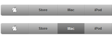
Apple’s website has long served as inspiration to web designers who recognize the superiority of simplicity in user experience. One of its most iconic features is the tabbed navigation – a long, narrow, slightly-rounded set of immaculately devised and executed buttons that serve as the launchpad for Apple.com.
While the advances in this latest adaptation of the CSS standard are widely applied and encouraged, some browsers offer more support for them than others (Internet Explorer least among them). Despite their discrepencies in adapting to it, however, most have offered custom syntax solutions for some of the more highly favored and regarded properties. Here are a few examples of the newly implemented properties that I utilized for this project…
Border-Radius
To simplify the structure of HTML and eliminate the need for images, CSS3 introduces the border-radius property.
border-radius: 5px 5px 5px 5px;
-moz-border-radius: 5px 5px 5px 5px; /* Firefox */
-webkit-border-radius: 5px 5px 5px 5px; /* Chrome & Safari */
SUPPORT NOTE : The latest versions of Firefox, Chrome and Safari support border-radius, while Internet Explorer (8 and older) does not.
Gradients
Before CSS3, creating a gradual blend between colors was only possible through images set to repeat over the background of an element, but a series of solutions for all major browsers enables simple yet clean and clear gradients.
background: -moz-linear-gradient(top,  #b3b3b3,  #6e6e6e); /* Firefox */
background: -webkit-gradient(linear, left top, left bottom, from(#b3b3b3), to(#6e6e6e)); /* Chrome & Safari */
filter: progid:DXImageTransform.Microsoft.gradient(startColorstr='#b3b3b3', endColorstr='#6e6e6e'); /* Internet Explorer */
SUPPORT NOTE : The latest versions of Firefox, Chrome, Safari and Internet Explorer support gradients.
Text-Shadow
CSS3 enables drop shadows of variable direction and size on text via the text-shadow property, allowing text to remain dynamic while retaining the drop-shadow style.
text-shadow: #cecece 1px 2px 3px; /* 1px right, 2px below, 3px blur */
SUPPORT NOTE : The latest versions of Firefox, Chrome and Safari support text-shadow, while Internet Explorer (8 and older) does not.
The Code
I elected to keep the HTML structure as simple as possible to accommodate for the extensive CSS. Below you will find the full CSS and HTML for the project.
CSS
body { margin: 0; padding: 0; }

a, a:hover, a:active, a:visited, a:visited:hover { text-decoration: none; border: none; outline: none; }

div.nav {
	margin: 18px auto 0px auto;
	border-width: 1px 1px 1px 1px;
	border-style: solid;
	border-color: #fff #dfdfdf #dfdfdf #dfdfdf;
	border-radius: 5px 5px 5px 5px;
	-moz-border-radius: 5px 5px 5px 5px;
	-webkit-border-radius: 5px 5px 5px 5px;
	display: table;
}

div.nav ul {
	margin: 0px 0px 0px 0px;
	padding: 0px 0px 0px 0px;
	border-width: 0px 0px 1px 0px;
	border-style: solid;
	border-color: #9f9f9f;
	border-radius: 5px 5px 5px 5px;
	-moz-border-radius: 5px 5px 5px 5px;
	-webkit-border-radius: 5px 5px 5px 5px;
	background: -webkit-gradient(linear, left top, left bottom, from(#b3b3b3), to(#6e6e6e));
	background: -moz-linear-gradient(top,  #b3b3b3,  #6e6e6e);
	filter: progid:DXImageTransform.Microsoft.gradient(startColorstr='#b3b3b3', endColorstr='#6e6e6e');
	display: inline-block;
	list-style: none;
}

div.nav ul li {
	margin: 0px 1px 0px 0px;
	padding: 0px 0px 0px 0px;
	background: -webkit-gradient(linear, left top, left bottom, from(#cecece), to(#8c8c8c));
	background: -moz-linear-gradient(top,  #cecece,  #8c8c8c);
	filter: progid:DXImageTransform.Microsoft.gradient(startColorstr='#cecece', endColorstr='#8c8c8c');
	float: left;
}
div.nav ul li:first-child {
	border-radius: 5px 0px 0px 5px;
	-moz-border-radius: 5px 0px 0px 5px;
	-webkit-border-radius: 5px 0px 0px 5px;
}
div.nav ul li:last-child {
	margin-right: 0px !important;
	border-radius: 0px 5px 5px 0px;
	-moz-border-radius: 0px 5px 5px 0px;
	-webkit-border-radius: 0px 5px 5px 0px;
}
div.nav ul li a {
	margin: 0px 1px 0px 1px;
	padding: 11px 33px 11px 33px;
	background: -webkit-gradient(linear, left top, left bottom, from(#cacaca), to(#848484));
	background: -moz-linear-gradient(top,  #cacaca,  #848484);
	filter: progid:DXImageTransform.Microsoft.gradient(startColorstr='#cacaca', endColorstr='#848484');
	float: left;
	/*-*/
	font-family: Lucida Sans, Arial, Helvetica, sans-serif;
	font-size: 12px;
	font-weight: bold;
	color: #252525;
	text-shadow: #cecece 0px 1px 0px;
}

div.nav ul li:first-child a {
	border-radius: 5px 0px 0px 5px;
	-moz-border-radius: 5px 0px 0px 5px;
	-webkit-border-radius: 5px 0px 0px 5px;
}
div.nav ul li:last-child a {
	margin-right: 0px !important;
	border-radius: 0px 5px 5px 0px;
	-moz-border-radius: 0px 5px 5px 0px;
	-webkit-border-radius: 0px 5px 5px 0px;
}

div.nav ul li:hover {
	background: -webkit-gradient(linear, left top, left bottom, from(#999999), to(#5f5f5f));
	background: -moz-linear-gradient(top,  #999999,  #5f5f5f);
	filter: progid:DXImageTransform.Microsoft.gradient(startColorstr='#999999', endColorstr='#5f5f5f');
}
div.nav ul li:hover a {
	padding: 11px 33px 11px 33px;
	background: -webkit-gradient(linear, left top, left bottom, from(#929292), to(#535353));
	background: -moz-linear-gradient(top,  #929292,  #535353);
	filter: progid:DXImageTransform.Microsoft.gradient(startColorstr='#929292', endColorstr='#535353');
	/*-*/
	color: #fff;
	text-shadow: #454545 0px -1px 1px;
}
div.nav ul li:active {
	background: -webkit-gradient(linear, left top, left bottom, from(#242424), to(#3f3f3f));
	background: -moz-linear-gradient(top,  #242424,  #3f3f3f);
	filter: progid:DXImageTransform.Microsoft.gradient(startColorstr='#242424', endColorstr='#3f3f3f');
}
div.nav ul li:active a {
	margin: 0px 0px 0px 0px;
	padding: 9px 33px 11px 33px;
	border-width: 2px 1px 0px 1px;
	border-style: solid;
	border-color: #282928 #3f3f3f #525051 #3f3f3f;
	-webkit-box-shadow: inset 0 -10px 20px rgba(0, 0, 0, .05), inset 0 2px 5px #363636, inset 0 0 0 1px rgba(255, 255, 255, .1);
	-moz-box-shadow: inset 0 -10px 20px rgba(0, 0, 0, .05), inset 0 2px 5px #363636, inset 0 0 0 1px rgba(255, 255, 255, .1);
	background: -webkit-gradient(linear, left top, left bottom, from(#999999), to(#5f5f5f));
	background: -moz-linear-gradient(top,  #999999,  #5f5f5f);
	filter: progid:DXImageTransform.Microsoft.gradient(startColorstr='#999999', endColorstr='#5f5f5f');
	color: #fff;
	text-shadow: #454545 0px -1px 1px;
}
div.nav ul li:last-child:active a {
	padding-right: 34px;
}
div.nav ul li.selected {
	background: -webkit-gradient(linear, left top, left bottom, from(#242424), to(#3f3f3f));
	background: -moz-linear-gradient(top,  #242424,  #3f3f3f);
	filter: progid:DXImageTransform.Microsoft.gradient(startColorstr='#242424', endColorstr='#3f3f3f');
}
div.nav ul li.selected a {
	margin: 0px 0px 0px 0px;
	padding: 9px 33px 11px 33px;
	border-width: 2px 1px 0px 1px;
	border-style: solid;
	border-color: #282928 #3f3f3f #525051 #3f3f3f;
	background: -webkit-gradient(linear, left top, left bottom, from(#373837), to(#525051));
	background: -moz-linear-gradient(top,  #373837,  #525051);
	filter: progid:DXImageTransform.Microsoft.gradient(startColorstr='#373837', endColorstr='#525051');
	/*-*/
	color: #fff;
	text-shadow: #454545 0px -1px 1px;
}
div.nav ul li.selected:last-child a {
	padding-right: 34px;
}

/*-----*/

div.nav ul li.logo a {
	padding: 5px 34px 7px 34px;
}
div.nav ul li.logo:active a {
	padding: 5px 35px 7px 35px;
	border: none;
}
div.nav ul li.logo a img { width: 24px; height: 24px; }

/*-----*/

div.nav ul li.search a {
	padding: 8px 9px 9px 7px;
}
div.nav ul li.search a input {
	width: 120px;
	height: 17px;
	padding: 0px 0px 0px 20px;
	border-width: 1px 1px 1px 1px;
	border-style: solid;
	border-color: #888 #b0b0b0 #dedede #b0b0b0;
	border-radius: 10px 10px 10px 10px;
	-moz-border-radius: 10px 10px 10px 10px;
	-webkit-border-radius: 10px 10px 10px 10px;
	background: #fff url(button_search.png) no-repeat 5px 3px;
	/*-*/
	font-family: "Lucida Grande", "Lucida Sans Unicode", Arial, Verdana, sans-serif;
	font-size: 11px;
	color: #7e7e7e;
}
div.nav ul li.search:hover, div.nav ul li.search:active {
	background: -webkit-gradient(linear, left top, left bottom, from(#cecece), to(#8c8c8c));
	background: -moz-linear-gradient(top,  #cecece,  #8c8c8c);
	filter: progid:DXImageTransform.Microsoft.gradient(startColorstr='#cecece', endColorstr='#8c8c8c');
}
div.nav ul li.search:hover a, div.nav ul li.search:active a {
	margin: 0px 1px 0px 1px;
	border: none;
	-webkit-box-shadow: none;
	-moz-box-shadow: none;
	background: -webkit-gradient(linear, left top, left bottom, from(#cacaca), to(#848484));
	background: -moz-linear-gradient(top,  #cacaca,  #848484);
	filter: progid:DXImageTransform.Microsoft.gradient(startColorstr='#cacaca', endColorstr='#848484');
}
div.nav ul li.search:active a {
	padding: 8px 9px 9px 7px;
}
HTML
<div class="nav">
    <ul>
        <li class="logo"><a href="#"><img src="logo_apple.png" border="0" /></a></li>
        <li><a href="#">Store</a></li>
        <li><a href="#">Mac</a></li>
        <li><a href="#">iPod</a></li>
        <li><a href="#">iPhone</a></li>
        <li><a href="#">iPad</a></li>
        <li><a href="#">iTunes</a></li>
        <li><a href="#">Support</a></li>
        <li class="search"><a><input type="text" value="Search" onclick="(this.value=='Search' ? this.value = '' : null)" /></a></li>
    </ul>
</div>
Closing Thoughts
Despite the cross-browser compatibility and rendering discrepancies, and the remaining limitations of CSS formatting relative to its image-oriented counterparts, the lines that divide image-intensive and script-intensive solutions in web design are blurring with the inclusion of more robust options in each new version of the CSS standard. Many of the restrictions of CSS2 that directed designers to image editing programs are forgotten in the face of the flexible and far-reaching enhancements achieved in CSS3. Given the significant progress made so far, one can only imagine the freedom and capability that the next stage of the standard will deliver.
The article source:http://coswyn.com/2010/10/03/pure-css3-apple-dot-com-navigation/
You might also like


Tags
accordion accordion menu animation navigation animation navigation menu carousel checkbox inputs css3 css3 menu css3 navigation date picker dialog drag drop drop down menu drop down navigation menu elastic navigation form form validation gallery glide navigation horizontal navigation menu hover effect image gallery image hover image lightbox image scroller image slideshow multi-level navigation menus rating select dependent select list slide image slider menu stylish form table tabs text effect text scroller tooltips tree menu vertical navigation menu