Submit your widget

Pure CSS3 Content slide Accordion

Created 12 years ago   Views 23860   downloads 4789    Author designmodo
 Pure CSS3 Content slide Accordion
View DemoDownload
78
Share |

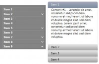
This is a pure CSS3 content accordion based on the Futurico UI Pro by Vladimir Kudinov. This will work on all browsers and devices that support the :target selector.

Step 1 – Basic HTML Markup

Let’s create three divs with a different id and each div will have a link with the class of tab and a div with the class of content.

To be able to style and open the accordion when we click on it we need to use the :target selector. The target selector will only work if we will have a link that points to an id and when we click on that link the id becomes the target element.

<div class="accordion">
	<div id="tab-1">
		<a href="#tab-1" class="tab">Option One</a>
		<div class="content">
			Content Here
		</div>
	</div>
	<div id="tab-2">
		<a href="#tab-2" class="tab">Option Two</a>
		<div class="content">
			Content Here
		</div>
	</div>
	<div id="tab-3">
		<a href="#tab-3" class="tab">Option Three</a>
		<div class="content">
			Content Here
		</div>
	</div>
</div>

Step 2 – Accordion Basic Layout

We’ll start by adding some CSS reset styles to remove all the margins, paddings and borders.

.accordion,.accordion div,.accordion h1,.accordion p,.accordion a,.accordion img,.accordion span,.accordion em,.accordion ul,.accordion li {
	margin: 0;
	padding: 0;
	border: none;
}
And then we’ll give a fixed 300px width (290px + 5px margin left + 5px padding right), background color, rounded corners and some shadows.
.accordion {
	width: 290px;
	padding: 1px 5px 5px 5px;
	background: #141517;

	-webkit-box-shadow: 0px 1px 0px rgba(255,255,255, .05);
	-moz-box-shadow: 0px 1px 0px rgba(255,255,255, .05);
	box-shadow: 0px 1px 0px rgba(255,255,255, .05);

	-webkit-border-radius: 2px;
	-moz-border-radius: 2px;
	border-radius: 2px;
}
Read more:http://designmodo.com/accordion-css3/