 Subscribe
 Follow Us
jQuery Vimeo-like top navigation
 13 years ago
  14388
14388  3267
3267
 n/a
n/a
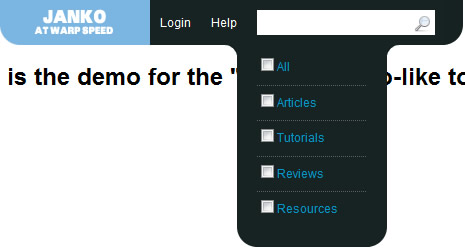
The menu that drops down when you hover search box. It offers you different search options that you can choose and narrow your search.
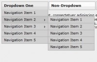
Simple CSS drop down menu based on unordered list. The structure is visually described in the image below:
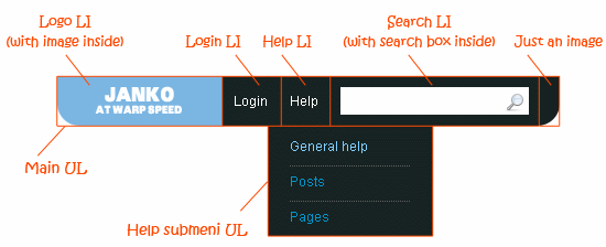
As you can see we have UL with four items. The first one is logo with short submenu. Then comes login link, Help link with submenu and search item with submenu. Each submenu is being shown when hover corresponding link.
So this is the base structure that we’ll use here:
<ul id="menu">
    <li class="logo">
        <img style="float:left;" alt="" src="menu_left.png"/>
        <ul id="main">
            <li>Welcome to <b>Create Vimeo-like top navigation</b> tutorial!</li>
        </ul>
    </li>
    <li><a href="#">Login</a>
    </li>
    <li><a href="#">Help</a>
        <ul id="help">
            <li><a href="#">General help</a></li>
            <li><a href="#">Posts</a></li>
            <li><a href="#">Pages</a></li>
        </ul>
    </li>
    <li class="searchContainer">
        <div>
        <input type="text" id="searchField" />
        <img src="magnifier.png" alt="Search" onclick="alert('You clicked on search button')" /></div>
        <ul id="search">
            <li><input id="cbxAll" type="checkbox" />All</li>
            <li><input id="Articles" type="checkbox" />Articles</li>
            <li><input id="Tutorials" type="checkbox" />Tutorials</li>
            <li><input id="Reviews" type="checkbox" />Reviews</li>
            <li><input id="Resources" type="checkbox" />Resources</li>
        </ul>
    </li>
</ul>
<img style="float:left;" alt="" src="menu_right.png"/>
And CSS styles:
/* menu */
#menu{ margin:0px; padding:0px; list-style:none; color:#fff; line-height:45px; display:inline-block;
    float:left; z-index:1000; }
#menu a { color:#fff; text-decoration:none; }
#menu > li {background:#172322 none repeat scroll 0 0; cursor:pointer; float:left; position:relative;
    padding:0px 10px;}
#menu > li a:hover {color:#B0D730;}
#menu .logo {background:transparent none repeat scroll 0% 0%; padding:0px;
    background-color:Transparent;}
/* sub-menus*/
#menu ul { padding:0px; margin:0px; display:block; display:inline;}
#menu li ul { position:absolute; left:-10px; top:0px; margin-top:45px; width:150px; line-height:16px;
    background-color:#172322; color:#0395CC; /* for IE */ display:none; }
#menu li:hover ul { display:block;}
#menu li ul li{ display:block; margin:5px 20px; padding: 5px 0px;  border-top: dotted 1px #606060;
    list-style-type:none; }
#menu li ul li:first-child { border-top: none; }
#menu li ul li a { display:block; color:#0395CC; }
#menu li ul li a:hover { color:#7FCDFE; }
/* main submenu */
#menu #main { left:0px; top:-20px; padding-top:20px; background-color:#7cb7e3; color:#fff;
    z-index:999;}
/* search */
.searchContainer div { background-color:#fff; display:inline; padding:5px;}
.searchContainer input[type="text"] {border:none;}
.searchContainer img { vertical-align:middle;}
But as you can see this is far away from the good looking Vimeo navigation. It is functional, of course, but we need that pretty rounded corners everywhere. The solution is actually simple and it is described in the image below:
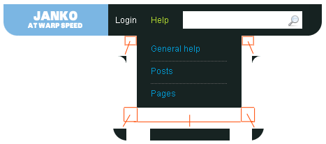
Now that looks fine. What we actually did can be seen in the code below. Let’s take Help submenu for the example:
<li><a href="#">Help</a>
    <ul id="help">
        <li>
            <img class="corner_inset_left" alt="" src="corner_inset_left.png"/>
            <a href="#">General help</a>
            <img class="corner_inset_right" alt="" src="corner_inset_right.png"/>
        </li>
        <li><a href="#">Posts</a></li>
        <li><a href="#">Pages</a></li>
        <li class="last">
            <img class="corner_left" alt="" src="corner_left.png"/>
            <img class="middle" alt="" src="dot.gif"/>
            <img class="corner_right" alt="" src="corner_right.png"/>
        </li>
    </ul>
</li>
We added two absolutely positioned images inside the first LI that will create “shoulders”. Also, we added one more LI to the end of the list that contains two absolutely positioned corners and one 1x1px stretched image to fill the empty space. And this is the additional styles that you need:
/* corners*/
#menu .corner_inset_left { position:absolute; top:0px; left:-12px;}
#menu .corner_inset_right { position:absolute; top:0px; left:150px;}
#menu .last { background:transparent none repeat scroll 0% 0%; margin:0px; padding:0px;
    border:none; position:relative; border:none; height:0px;}
#menu .corner_left { position:absolute; left:0px; top:0px;}
#menu .corner_right { position:absolute; left:132px; top:0px;}
#menu .middle { position:absolute; left:18px; height: 20px; width: 115px; top:0px;}
Now we have functional AND good looking top navigation. This might be optimized, so if you have free time or you need it for your projects, step on it. Or you can use this one as is :)
You might also like
Tags
accordion accordion menu animation navigation animation navigation menu carousel checkbox inputs css3 css3 menu css3 navigation date picker dialog drag drop drop down menu drop down navigation menu elastic navigation form form validation gallery glide navigation horizontal navigation menu hover effect image gallery image hover image lightbox image scroller image slideshow multi-level navigation menus rating select dependent select list slide image slider menu stylish form table tabs text effect text scroller tooltips tree menu vertical navigation menu