 Subscribe
 Follow Us
Codename Rainbows jQuery
 13 years ago
 15492
15492 2454
2454
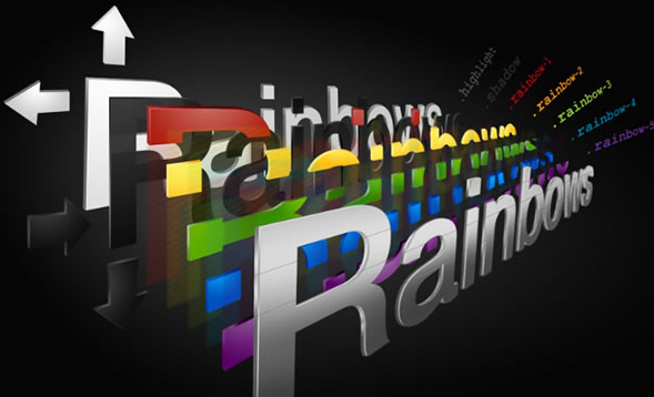
We use some JavaScript and CSS magic to apply a two-color gradient to any text. Shadows and highlights can also be applied.
This works especially well on big sites or dynamic content where it'd be impractical to create images for every instance.
First, somewhere in the <head>, call up the jQuery file and the Codename Rainbows script. For more information about this, see the jQuery documentation.
<script src="lib/j/jquery-1.3.2.min.js" type="text/javascript"></script>
<script src="lib/j/rainbows.js" type="text/javascript"></script>
Add some kind of class or ID or way to target the elements you want to give gradients, highlights or shadows. Keep in mind this only works on text. If you are trying to make a normal gradient as a background or something the use of images is highly recommended, and this won't work for that.
Your Options
Some stuff you can doOf course, there's the gradient. It needs two hex color values (full 6 digits, don't abbreviate ffffff to fff or the sky will fall on your head). Being creative with these, you can create illusions like the text becoming transparent (having one similar to the background color) or metallic (from white to a grey—this is the default).
Also possible are pseudo highlights and shadows.
rainbows.init({
  selector: 'selector of the text here--for example an h2 or #title',
  highlight: true or false,
  shadow: true or false,
  from: '# top hex code goes here',
  to: '# bottom hex code goes here'
 });
Shadows
Unlike in Photoshop, the size of the shadow can't be controlled. The opacity, however, can and should be tweaked depending on where it is going. A solid black might be too strong.
Highlights
Similar to shadows, the highlight uses the same concept but in the other direction and with white instead of black. It works best on large text, not so well on smaller text since unlike the shadow it uses an illusion and enlarges the text by about 1px. If this is a small percentage of the size of the font, it's not perceptible and can look rather nice.
Coloring
By default the highlights are white and the shadows are black. This can be changed in the CSS file for other effects like inset text, as discussed later.
By default, adding the script processes anything with a class 'rainbows' and gives it the default effect. New instances can be created with the following parameters, which can be added at the end of the rainbows file or in a separate file (which we recommend), or inline in the document within a <script> tag (if it is very page specific, like in our demo).
rainbows.init({
  selector: '.your_selector_here',
  highlight: true,
  shadow: true,
  from: '#555555',
  to: '#000000'
 });
The color at the top is the 'from' and the color at the bottom is the 'to.' Keep in mind that it applies to the height of the element, so the gradient might not be as steep, especially on large line-heights or text without any descenders.
The order of the declarations is not important, just be sure to not put a comma after the last attribute or the sky will fall on your head. And it will crash the JavaScript in IE (but won't be noticeable in other browsers).
The default .rainbows initialization is in the JavaScript file and can be changed or removed if necessary. Alternately, you can just create new instances depending on what element and style you need.
Add this CSS to your stylesheet or as its own stylesheet included at the end. We generally split them all up and just include them via PHP, but to each their own.
.rainbow {
 background: transparent;
 display: block;
 position: relative;
 height: 1px;
 overflow: hidden;
 z-index: 4;
 }

 .rainbow span {
  position: absolute;
  top: 0;
  left: 1px;
  display: block;
  xwhite-space: nowrap;
  }

 a .rainbow span { /* For within floated elements. */
  white-space: nowrap;
  }

.rainbows-highlight {
 color: #fff !important;
 display: block;
 position: absolute;
 top: -1px;
 left: 0px;
 z-index: 2;
 }

.rainbows-shadow {
 color: #000 !important;
 display:block;
 position: absolute;
 top: 1px;
 left: 2px; /* can be one or two depending on 90 or 135 degree global light */
 z-index: 3;
 }

.back .text .rainbows-shadow {
 color: #fff !important;
 opacity: 0.3;
 }
Check out the white paper to learn more about what exactly the code does, but basically this CSS gives the necessary styling to the elements generated by the JavaScript. Without it you'd just have a bunch of repeated text—not as stylish.
By default, shadows are black and highlights are white. They're staggered one pixel vertically and horizontally, based on what's in the rainbows.css file. That can be changed.
.rainbows-shadow {
 color: #fff !important;
 opacity: 0.7;
 }
Making the shadow white and getting rid of the highlight or changing it to a shadow, you can easily make the traditional inset text. Setting the shadow to white will do the trick, but reducing the opacity is recommended.
For Print
Since this works by cloning, if the page is meant to be printed out (for example in an article), you may want to consider adding in a print stylesheet. We will want to hide all the instances, like the shadows and highlights, and then just show one. And maybe make it black instead of white or whatever.
.rainbow,.rainbow-highlight,.rainbow-shadow { display: none }

.rainbow-1 { display: block; color: #000; }
Don't put that in your normal stylesheet though, or bad things will happen.
That's really all there is to it!
You might also like


Tags
accordion accordion menu animation navigation animation navigation menu carousel checkbox inputs css3 css3 menu css3 navigation date picker dialog drag drop drop down menu drop down navigation menu elastic navigation form form validation gallery glide navigation horizontal navigation menu hover effect image gallery image hover image lightbox image scroller image slideshow multi-level navigation menus rating select dependent select list slide image slider menu stylish form table tabs text effect text scroller tooltips tree menu vertical navigation menu