 Subscribe
 Follow Us
Nice Pure CSS3 Slick Menu
 13 years ago
 30729
30729 6125
6125
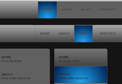
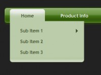
In this article we are trying to mimic the navigation menu in Dragon Interactive website using only CSS (no images, no JavaScript).
Note: This is an experimental example using the new features of CSS3. The effects can be seen in Latest Webkit Browser only. Gradients works in Firefox 3.6 but not the fade-in and fade-out transition.
Lets create the html used.
<div class="wrapper">
<div class="container"><ul class="menu" rel="sam1">
<li class="active"><a href="#">Home</a></li>
<li><a href="#">About</a></li>
<li ><a href="#">Blog</a></li>
<li><a href="#">Services</a></li>
<li><a href="#">Portfolio</a></li>
<li><a href="#">Contacts</a></li>
<li><a href="#">Twitter @insic</a></li>
</ul>
</div>
</div>
Now the CSS.
Lets add a gradients using CSS3 gradient property into our wrapper div.
.wrapper {
    width: 100%;
    height: 80px;
    background : #464646;
    background : -webkit-gradient(linear, left top, left bottom, from(rgb(168,168,168)), to(rgb(69,69,69)));
    background : -moz-linear-gradient(top, rgb(168,168,168), rgb(69,69,69));
    border-top: 2px solid #939393;
    position: relative;
    margin-bottom: 30px;
}
The CSS code for the menu item.
ul {
    margin: 0;
    padding: 0;
}

ul.menu {
    height: 80px;
    border-left: 1px solid rgba(0,0,0,0.3);
    border-right: 1px solid rgba(255,255,255,0.3);
    float:left;
}

ul.menu li {
    list-style: none;
    float:left;
    height: 79px;
    text-align: center;
    background: -webkit-gradient(radial, 50% 100%, 10, 50% 50%, 90, from(rgba(31,169,244,1)), to(rgba(0,28,78, 1)) );
    background: -moz-radial-gradient(center 80px 45deg, circle cover, rgba(31,169,244,1) 0%, rgba(0,28,78, 1) 100%);
    }

ul li a {
    display: block;
    padding: 0 20px;
    border-left: 1px solid rgba(255,255,255,0.1);
    border-right: 1px solid rgba(0,0,0,0.1);
    text-align: center;
    line-height: 79px;
    background : -webkit-gradient(linear, left top, left bottom, from(rgb(168,168,168)), to(rgb(69,69,69)));
    background : -moz-linear-gradient(top, rgb(168,168,168), rgb(69,69,69));
    -webkit-transition-property: background;
    -webkit-transition-duration: 700ms;
    -moz-transition-property: background;
    -moz-transition-duration: 700ms;
    }

ul li a:hover {
    background: transparent none;
}

ul li.active a{
    background: -webkit-gradient(radial, 50% 100%, 10, 50% 50%, 90, from(rgba(31,169,244,1)), to(rgba(0,28,78, 1)) );
    background: -moz-radial-gradient(center 80px 45deg, circle cover, rgba(31,169,244,1) 0%, rgba(0,28,78, 1) 100%);
}
You might also like


Tags
accordion accordion menu animation navigation animation navigation menu carousel checkbox inputs css3 css3 menu css3 navigation date picker dialog drag drop drop down menu drop down navigation menu elastic navigation form form validation gallery glide navigation horizontal navigation menu hover effect image gallery image hover image lightbox image scroller image slideshow multi-level navigation menus rating select dependent select list slide image slider menu stylish form table tabs text effect text scroller tooltips tree menu vertical navigation menu